You’re building your email list, right?
If you’re not, you need to start today.
Email is by far the most effective marketing channel we have today. Capterra found that the average return on $1 spent on email marketing is $44.25. Nothing else comes even close.
Think about it: email gives you the ability to reach your current and potential customers whenever you want. An incredible 91% of people check email at least once a day.
Having a list gives you more influence over your subscribers’ behavior and allows you to drive page views, sales, reviews, or anything else you’d like.
Creating great content isn’t enough.
Although getting lots of traffic and social shares is nice, it’s not the goal of content marketing.
Pop quiz: What is the real purpose of any marketing?
To make sales.
Now, you can’t typically do that straight from blog posts, at least not for most products.
However, what you can do is collect your readers’ contact information—even if it’s just an email.
Not long ago, you could get a decent sign-up rate just by having a box in your sidebar that said “subscribe to the blog.”
But now, brands are producing a lot of content. We don’t see this trend slowing down anytime soon.
People are overwhelmed by the amount of content coming at them. And everyone creating that content wants their email addresses.
That old opt-in form in the sidebar won’t collect much of anything other than dust these days.
As marketers, though, we evolve with the times, and our tactics evolve too.
We began to offer free products such as e-books, courses, checklists, and videos for anyone who signed up to our lists. These are called lead magnets because…well…they attract leads.
And it worked.
You’re essentially trading value in the form of premium content for your reader’s email address.
But now, almost everyone offers a free bonus.
If your lead magnet isn’t something special, two things can happen.
Either you won’t get many sign-ups, or you will get sign-ups, but those readers will be unimpressed with the bonus and unsubscribe right away.
The most successful marketers today create lead magnets that are a step above everyone else’s.
Yes, it takes some time and effort, but raising your opt-in rate just 2% or 3% can produce tens of thousands of dollars in the upcoming year.
It also takes some skill and knowledge to create a good lead magnet, which is what we’re going to teach you in this post.
Let’s get started.
1. Research always comes first
One of the hardest parts of being a good marketer is understanding your audience.
Even when you think you understand them, you might realize that you have different views on what is and isn’t valuable.
So if you’ve created lead magnets (of any kind), but they’re only converting at 1% or less, you’re probably off the mark.
And we know that’s tough to hear, but we think it’s actually good news. It’s really easy to fix, and you can double or triple your opt-in rates just by fixing this one issue.
The point of this research is to discover what your audience finds most valuable.
Validate that your audience is interested in a topic
If you have a blog that gets consistent traffic, this will be extremely easy.
If you want to see what your audience is most interested in, simply look at the number of times they’ve viewed each article. Additionally, you can look at the number of comments and social shares generated by the articles.
Create a spreadsheet with all your top posts and their traffic stats over a reasonable period (at least three months).
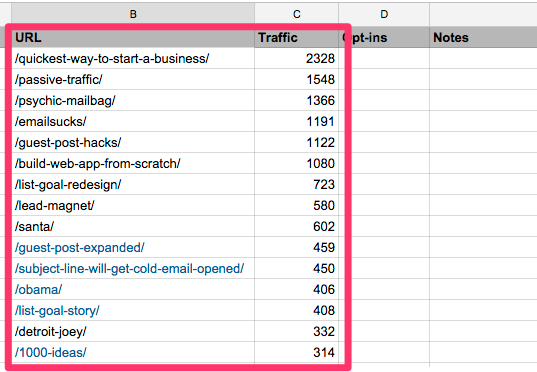
Sort by traffic, and you will see the topics that your specific audience cares about the most.
Then, you can create an offer around those topics. You can use this offer as a content upgrade, or you can promote it around your website.
Here are some examples:
- Article: “22 Gmail Plugins That All Content Marketers Need to Know About”
- Offer: Get the exact templates I use to reach out to influencers
- Article: “How to Make Custom Images for Your Blog Posts Without Hiring a Designer”
- Offer: A private list of 10 designers who will create custom images for $5 per image
2. See what your competitors are offering
If you have a new site or one with few posts and low traffic levels, you can’t use Method 1. What you can do, however, is look at your competitors.
Your most visible competitors have likely been blogging for years. You can take advantage of their experience by seeing what their audience likes the most.
Start by identifying 5-10 competitors.
Add these to a blank spreadsheet. Next to each competitor, create a column for their main lead magnet and 5 more columns for their 5 most popular posts.
To find the main lead magnet, visit the blog (usually the Home page), and look for a highlighted area:
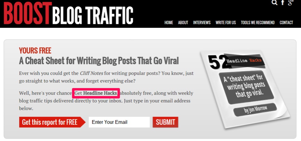
Record the title and a short description (optional) in your spreadsheet.
Next, we need the most popular posts. Some bloggers will include a “Popular Posts” widget in the sidebar. Personally, we don’t trust it because it can be manipulated (and often is).
Instead, use BuzzSumo to find the most shared posts. Enter your competitor’s URL into the content explorer, and sort by total shares.
Record the headlines of the top 5 posts into your spreadsheet.
Here’s what your sheet should look like. Keep going until you’ve filled it in.

This spreadsheet has a few extremely practical applications.
First, it tells us what lead magnet each blogger has found to convert the best—at least for now (further testing could prove otherwise).
If you were starting a blog in this space and had the background to write a short e-book titled How to Get Your First 10,000 Subscribers, you can be confident that it would convert well based on the Social Triggers’ lead magnet.
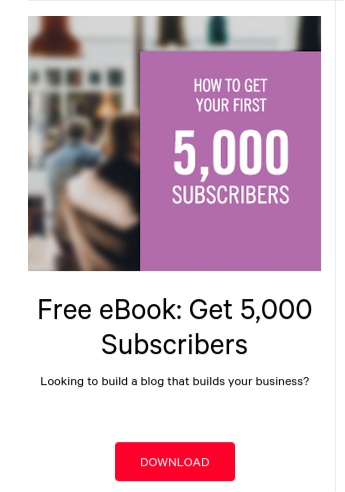
The second application is just as useful in our opinion. One danger of simply creating a lead magnet along the same lines as the existing ones is that you could be perceived as a copycat.
In this scenario, if we’re bloggers looking for traffic and subscriber advice and come across both your site and Social Triggers, we’re probably not signing up for both. We’ll pick the one that looks most credible, which is the one on an established authority site.
Now go back to your spreadsheet.
You have a list of posts that resonate with the readers of your niche. Categorize all the posts to reveal the most popular general topics:
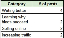
With the limited selection of posts in my spreadsheet, we identified 4 categories:
- Writing better (4 posts)
- Learning why blogs succeed (2)
- Selling online (2)
- Increasing traffic and subscribers (2)
Now, look at the top categories that you just identified, and look at the lead magnets offered by your competitors. Find the gap.
It’s clear from our very limited analysis that bloggers currently care a lot about writing better. This makes sense given the shift towards higher quality content.
Boost Blog Traffic’s Headline Hacks is about writing great headlines, but you could focus your offer on a different area of writing. You could base a lead magnet on those popular posts you recorded in that category.
For example:
- The 20 Words All Successful Bloggers Use in Their Writing
- 51 Essential Time-Saving Resources for Any Blogger
- Free e-book: The Simple Way I Write 1,000-Word High Quality Posts in an Hour
3. Look at what your visitors buy
A great lead magnet should be of such quality that people would actually pay for it. But since you’ll be giving it away, you’ll obviously get great conversion rates.
There are tons of places to look if you want to see what your readers value, but there are three in particular that work for almost any niche.
Source #1 – The Kindle marketplace: Amazon started out as a book seller and only later became the giant it is today.
But it still sells books—a lot of them.
We would look primarily at the Kindle books, just because e-books are more like a typical lead magnet than physical books are.
The people who like to buy things online (hopefully from you eventually) are usually the same people who would feel comfortable buying a book online.
Start by heading to the Kindle store.
On the left-hand sidebar, you’ll see a list of categories. When you click one, the new page will have a new list of categories. Keep clicking through until you get to your specific niche.
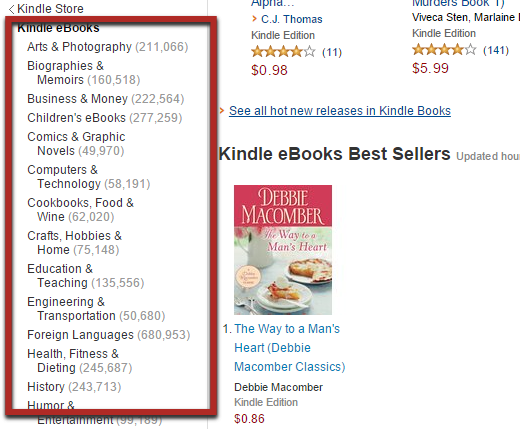
For the sake of an example, let’s say we run a yoga website.
We clicked through three different levels to find the yoga section:

Obviously, you get a list of books as your results.
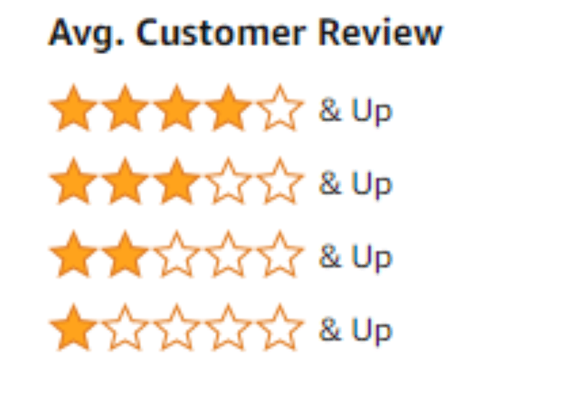
On the left, sort the results by the average customer review:
Now, you’ll have the top-rated results in your category:
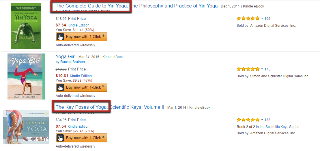
Just from the top few results, you can already come up with two great ideas for lead magnets that people are willing to pay for:
- A guide to Yin Yoga (free e-book)
- A guide to Yoga Poses (could be an e-book, video series, or even an email course)
Reading the actual reviews will tell you what readers valued the most. Make sure you include those aspects in your lead magnet.
Source #2 – What do your competitors sell? Your competitors have a large portion of your target audience.
Assuming they are more established than you, they probably have products of their own.
If you go to their site, you’ll probably find a link to a shop or landing page in the top menu bar or in the sidebar:
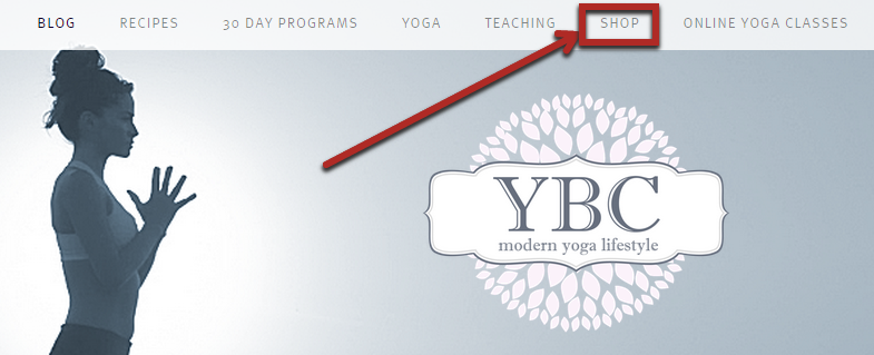
There are a few things we can learn from their products that could help you come up with a great lead magnet that your audience will value.
The first option is to look at the “intro level” products. These cost under $20, which isn’t making anyone very much money.
But since people buy them, you know they value them, which is all the evidence you need.
Now, you’ll create a similar product but offer it as a free lead magnet.
For example, on the example authority site pictured above, there’s a product in the shop that consists of a 20-minute guided yoga meditation session:
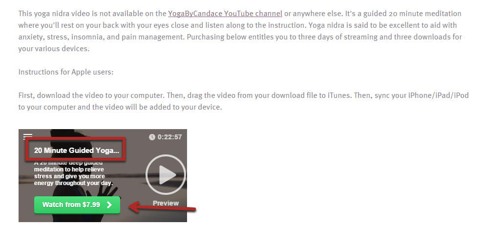
People pay $7.99 for it.
When it comes to products at this level, there are three types of people:
- Very willing to pay – They’re pretty sure that they’ll like the product and think the money is well worth it.
- Not sure – They think they might like it, but they’re not sure.
- Will never pay – Some people either don’t have the money to spend on such products or always try to find a free alternative.
When you create a free version of a product they are looking for, you will attract the people in groups 2 and 3.
Obviously, the ones in group 2 are most valuable because they might actually buy from you in the future.
Here is what happens. When they discover this product on your competitor’s site, they might search for a “free 20 minute guided yoga meditation session.”
They are looking for a free version to give it a try, and then they might purchase the other paid product based on that.
If you really impress them with your free lead magnet, they might feel like they don’t need the paid product.
They figure that if your free content is that good, your paid products are probably even better. If they’re going to buy something, it’ll be from you in most cases.
Source #3 – Look for course ideas: Most lead magnets are problem-based. They solve a small, specific problem that your audience has.
Essentially, they’re mini-courses on a topic.
At the same time, online education is exploding in popularity.
Universities are putting up full high-quality courses, and private educators are creating their own courses. Some are big, and some are small.
The best place to look for these is Udemy. Anyone can post a course there, which has led to a huge variety of courses.
Start by finding courses about your niche.
You can search for a keyword in the search bar, browse the course catalog, or pick categories on the left hand side.
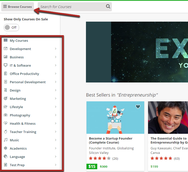
In our example case, we searched for classes on “yoga.”
Always start by sorting the results by popularity. You want to see courses that people are actually interested in.
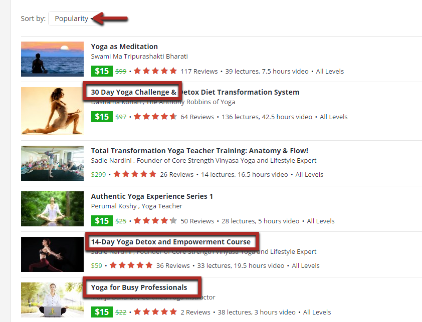
From the top results, you can already see three great ideas for a lead magnet:
- A 30-day yoga email course challenge
- A 14-day yoga detox email course
- A video or email course on yoga for busy professionals
People actually pay for these courses and obviously value them. If you offer a free version, your target audience will be interested as well.
4. Most readers will tell you, just ask them
One amazing source of lead magnet ideas are the people who are already on your email list.
They already like your content and obviously feel that you have something valuable to offer them.
When you send them your next post, ask them if there’s any way you could improve it for them.
Don’t publish the post publicly yet, wait for any feedback.
If you have a large list, you only need to send this to a few hundred subscribers at first.
Send them a template like this:
Hey (name),
I just wanted to share with you the latest (your brand) blog post, called:
(Post title and link)
(2 paragraph description of post)
Could you do me a quick favor?
After you read the post, I’d like you to tell me if there’s any way that I could make the post better. Is there anything you’re especially curious about?
Thanks,
(Your name)
Your best readers will reply with some great ideas for a lead magnet.
You can create one quickly and then offer it within the post once you publish it publicly.
5. Don’t be afraid to listen
Another great source of high value lead magnet ideas is your comments section—specifically from readers who haven’t yet signed up for your email list.
They clearly read your content—and like it enough to comment—and probably even have your blog bookmarked.
So, what will it take to get their email addresses?
Readers will often tell you the things they are most curious about in the comments section.
6. One way to skyrocket your opt-in rate
In order to get someone to subscribe to your email list, you need to offer them something they want in exchange.
And in order to generate interest in a lead magnet, your reader needs to be interested in the topic you’re writing about in your blog post.
So, what would happen if you focused on writing about topics on your blog that your audience was most interested in?
It would attract more shares, traffic, and eyeballs to your lead magnet. This will, of course, lead to more email subscribers.
How do you find out what they’re most interested in?
Simple. Go to Google Analytics (or whatever analytics software you’re using), and look at the data based on pages.
To do this, navigate to “Behavior > Site Content > All pages” using the left menu.
Then, decide which category each of your top posts belongs to. We’d look at your top 10-30 posts, depending on the number of posts you have all together.
You’ll notice that one or two categories get way more views on average than all the rest.
If you simply focus more attention on those categories, not only will you grow your email list but you’ll also grow your overall site traffic.
How to see what content your audience loves when you don’t have an audience:
That simple strategy above assumes that you’ve already developed a healthy level of blog traffic.
Obviously, that isn’t the case for many people.
You have two options at this point.
You could just write about a whole bunch of different topics in your niche and see which ones do well.
Which is totally okay.
Or you could do a bit of research and find out which topics are the most popular for sure.
There are two main ways you can do this type of research.
First, you can try Reddit.
Find a subreddit related to your niche. For example, if we were starting a new marketing blog from scratch and with no prior knowledge of what’s popular, we would go to the marketing subreddit.
Then, click the “top” button along the top menu to see the top posts of all time.
All subreddits have thousands of posts submitted to them (some have millions), so you get a really good idea of what that particular audience likes.
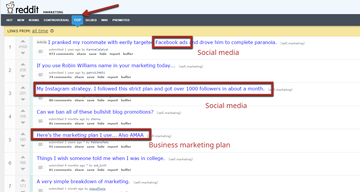
Go through the top 100 results or so and categorize them like we did before.
You’ll see that certain categories pop up way more than others. Note that there will be irrelevant submissions as well since Reddit submissions include much more than just blog posts.
The second option is to look at close competitors.
If they are more established and have the audience you want, you can look at their posts and again see which topics are the hottest.
The biggest limitation here is that you don’t have their traffic stats.
However, you can write down the title of each post along with the number of comments or social shares it has:

It’s not a perfect substitute for traffic numbers, but it’s a good approximation.
7. Don’t just create another lead magnet
The biggest thing we’ve tried to emphasize is that you need high quality lead magnets.
Your new subscriber should be shocked that you aren’t charging for it.
After you give it away a few hundred times, you should get at least one or two emails telling you exactly that.
The biggest mistake marketers make when creating lead magnets is that they make offers that are too vague.
You must create a useful offer that solves one specific problem in your reader’s life.
Otherwise, you won’t make a lasting impression on your new subscriber. They’ll throw out your freebie once they go through it, and there’s a good chance they’ll unsubscribe the first chance they get.
But if you do make a great first impression and deliver something that makes a difference in their life in the short term, they won’t forget you.
Your lead magnet can be in any format. It doesn’t matter. All that matters is that it:
- is about something your reader cares about,
- delivers massive value (high quality), and
- accomplishes (at least) one specific thing in your subscriber’s life.
To make things crystal clear, let’s look at some examples.
Example 1: E-books
While e-books can be great lead magnets, they can also be terrible. They don’t need to be long, but they need to address a specific topic. Too often, e-books are filled with fluff for the sake of filling pages.
That being said, a good e-book allows you to dive into a fairly complex issue in a way that a checklist or worksheet can’t.
Michael Hyatt offers a free e-book with a very specific claim: take 10 hours off your work week. This is a great topic because you’ll see the results almost immediately.
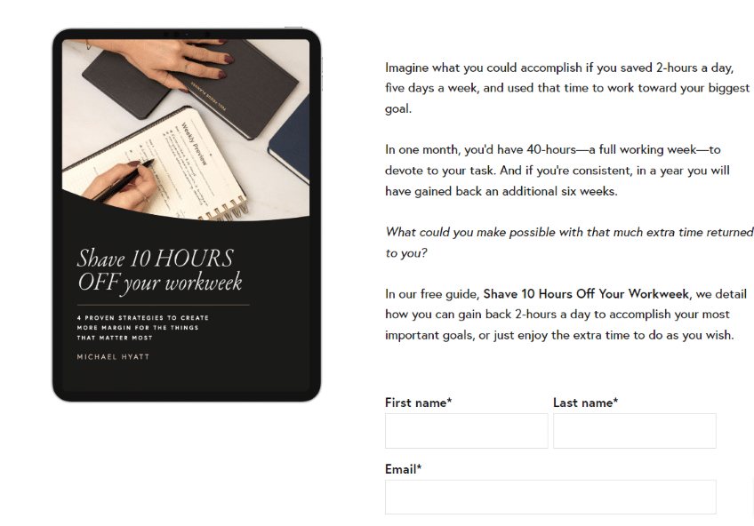
In addition, he’s a best-selling author and a successful person, which he highlights just before he offers the book. It’s always a good idea to establish credibility to help reduce friction.
Example 2: Free Courses
We love using free courses as a giveaway. Not only do you get your subscriber to continuously refer to your material and get more familiar with you, but you also get them into the habit of reading your emails.
One other advantage of giving away a course is that subscribers usually perceive courses to be more valuable, so they take them more seriously.
Example 3: Lists or Short Guides
If you’re an expert in some field, you can use your expertise to deliver massive value without spending a lot of time on an offer.
On BloggerJet, Tim Soulo offers a short guide on how to grow blogs to 100K visitors per month.

A short guide or list is easy to write as long as you know what should go into it. Since Tim has a ton of experience with growing blogs, this probably took him an hour or two to put together.
Example 4: Free Trial
What if you don’t run a blog-based business? Don’t worry—lead magnets can still work well for you.
Any company with a product, particularly a scalable one such as software, instantly has something of value to offer: a free trial.
Not only will this increase your initial sign-up rates but it will also increase your conversion rates down the line because people don’t like losing things they already have.
Here are 2 simple lead magnets that you can create.
How to make a high quality PDF version of a guide:
If you post really lengthy guides and tutorials, it’s tough for readers to get through the whole thing at once.
If they don’t have a lot of free time, it’s hard for them to ever get through it.
Many bloggers offer a copy of the post in a PDF format in exchange for the reader’s email.
It’s something we’ve seen Brian Dean do fairly often:
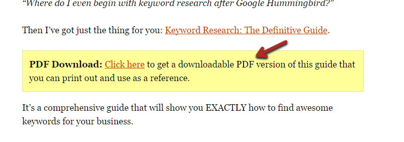
This is a solid option for a lead magnet for a few reasons.
First, anyone who subscribes because of it is probably going to use it. They’ll download it and read it at work, on their commute, or somewhere they have a bit of free time.
Secondly, it’s really easy for you to make. If you’re not creating lead magnets because you simply don’t have the time to make them, you can create a PDF version of a post in just a few minutes.
Something we strongly suggest doing is creating a custom cover for the post. It makes it look like a professional e-book, which readers will value more.
You can make one yourself, or you can buy one from Fiverr. Just search for “e-book cover,” and pick a gig with a high rating:
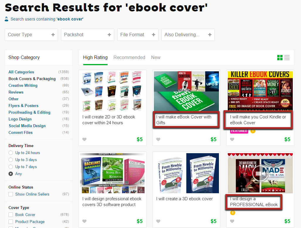
Note that most take at least a few days to get back to you with the cover, so plan as far ahead as possible.
Aside from that, you can convert your post into a PDF by just highlighting and copying all the content in the article.
And then pasting it inside a blank Word document.
There might be a few formatting errors, so go through the article, and fix any weird spacing.
If you use Google Docs in particular, it does something neat.
The heading tags from WordPress are automatically recognized as headings in the document.
This allows you to quickly create a table of contents for your PDF, which makes it even more useful.
Just go to “Insert > Table of contents”:
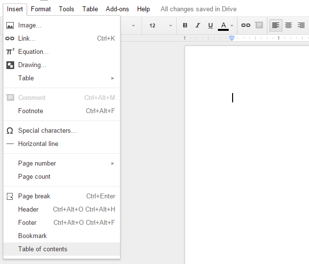
You’ll get a very simple table of contents with links to each section:
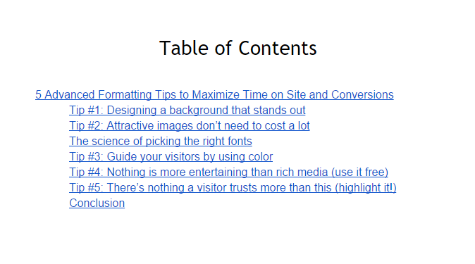
Depending on the number of heading tags you use, this can be very useful.
If you do have a cover made, just paste it on the first page before all the content.
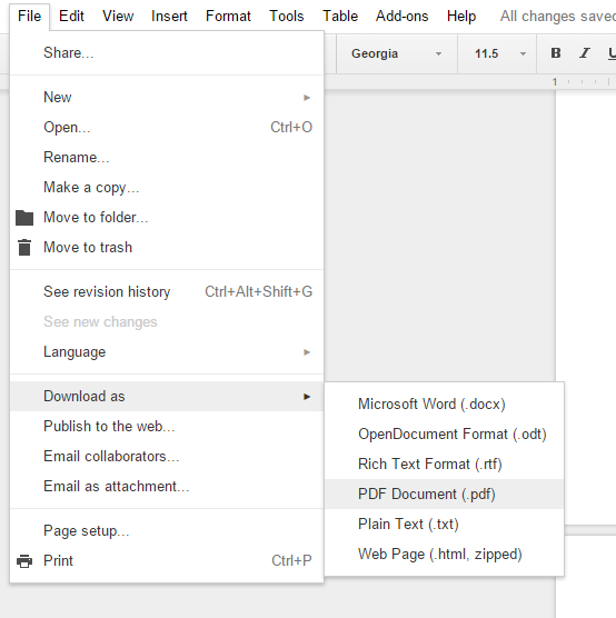
Then, when everything looks good, go to “File > Download as,” and choose PDF:
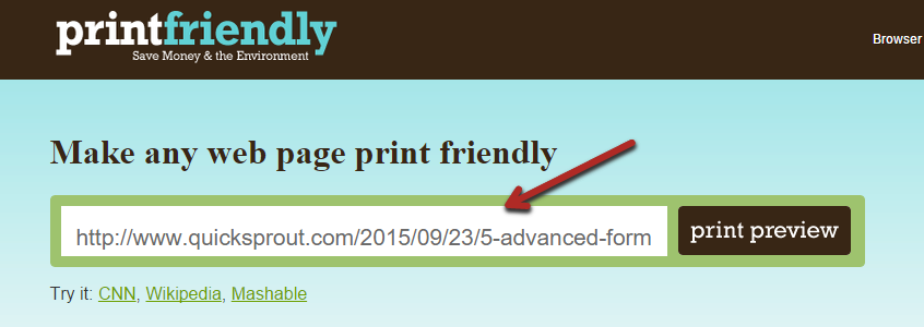
Alternatively, use this simple tool: If you’re really pressed for time, you can use a tool called PrintFriendly.
Paste your URL in the tool, and click the “print preview” button:
The tool will quickly generate a minimalistic version of your post, optimized for printing.
If anything shows up weird, you can hover over it and delete it (“click to delete”):
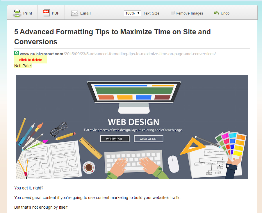
If it looks good, click the “PDF” button at the top of the page, which will start downloading the file.
How to make a high quality checklist:
The second type of common lead magnet is a checklist.
Checklists are a great way of breaking down a process into concrete steps that your audience can follow with ease.
They are best used when you’re outlining a particular strategy or technique to your readers.
But what do you think of when you hear the word “checklist”?
Probably something like this:
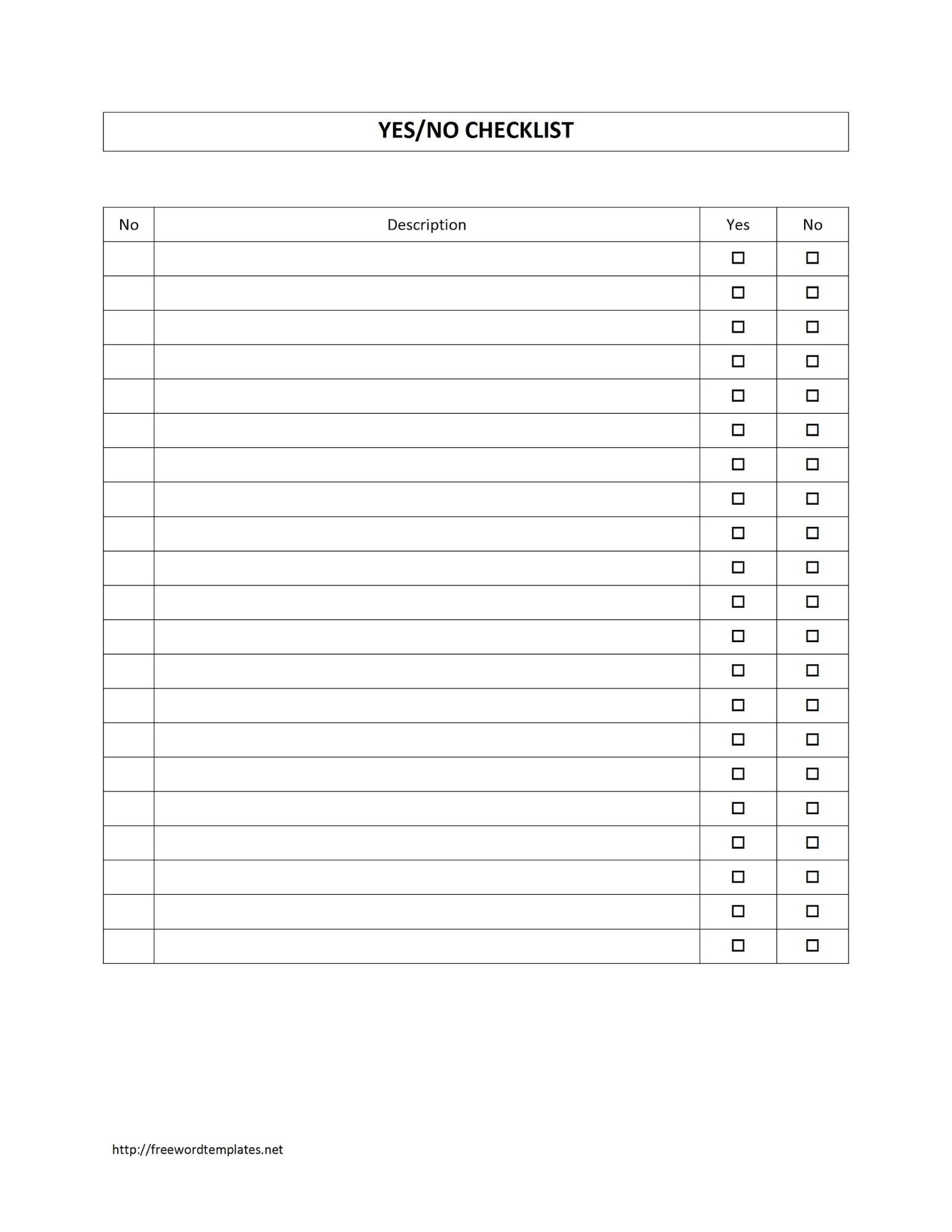
Don’t get me wrong, it could still be useful, but it’s so plain.
But what if there was a way to make a checklist sexy? To really blow away your new subscribers?
That’d be pretty cool.
It’s something that Bryan Harris at Video Fruit has done really well in the past. Take a look at this checklist:
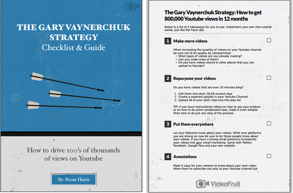
That is not a typical checklist. It has a professional cover plus a custom layout that looks amazing.
People might actually print this out and use it—unlike what they do with most checklists, which might be used once and then thrown into the recycling.
And although that looks super fancy, there’s no reason you can’t create something similar.
Again, you can get a similar cover made by a designer on Fiverr.
Or you can create the actual checklist yourself. We’ll show you how to now, step by step.
You could use software like Illustrator, but you can make it easily in a standard Google Doc.
First, start with your headline. Make it big and bold, and pick a font you like:
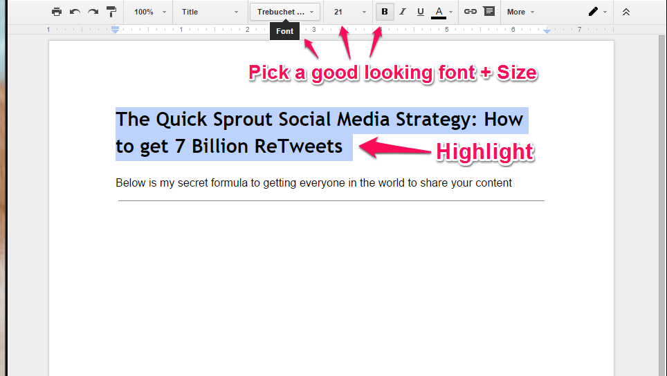
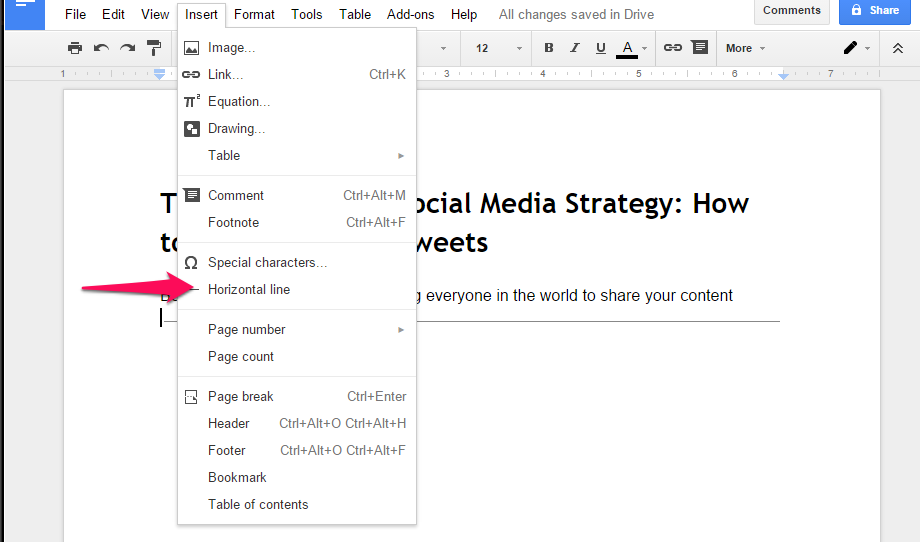
Then, write a brief description in a normal size.
After, go to “Insert > Horizontal line” to separate the header from the content:
Now, how do you get the number, step name, and check box to look so nice and lined up?
It’s pretty simple.
Again, go to “Insert” on the menu, but this time, insert a 1×3 table:

Then, drag the vertical lines separating the cells to match the layout you want.
To re-create Brian’s, make the left cell a square. Then, highlight that square cell and change the text to white, and the background to black. You’ll also have to increase the size of the font:
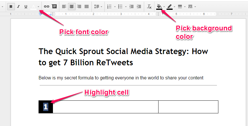
The middle cell is simple enough: it’s the name of the step on the checklist. Just type it in.
And then we come to the checkbox. There are a few ways to do this, but the easiest is probably to put your cursor in the third cell, and go to “Insert > Drawing,” which will bring up a new screen.
Pick a rectangle from the shapes drop down menu, and then draw a square by holding a shift key while you click and drag a box out.
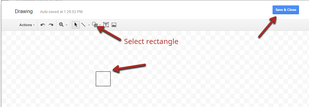
Click “Save,” and close when you’re done. The box will show up in the third cell. If you click your new square, you can drag it to resize it.
So, now you have something that looks like this:
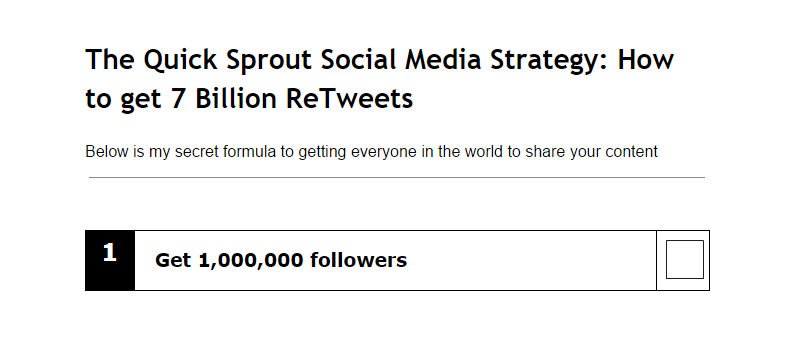
Doesn’t quite look the same, does it?
Now you need to highlight all three cells of the table, right-click, and select “Table properties”:
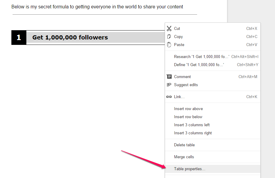
In this pop-up, change the border to “0 pt”, which means there is no border:
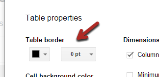
If any of your cell’s text isn’t centered, highlight that specific cell, right-click it again, and choose Table properties. Then, change the vertical alignment to “center.”
If you’ve done that, you have a good-looking table, and you’ve done the hardest part.
Now, just go to the lines below and type in a description, including any bullet points.
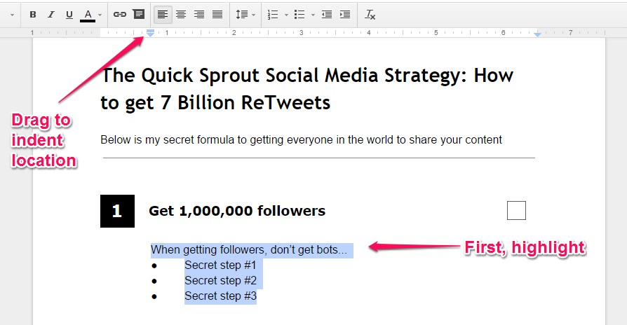
You can align the description with your step title by highlighting the words and then dragging that little blue marker on the top ruler over to the start of your title.
Feel free to copy and paste that whole section to save time on the rest of the steps.
Finally, if you’d like to give the page a background, go to “File > Page setup…”, and choose a color for “page color”:
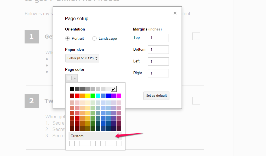
You can enter a custom color if you’d like.
In the end, we have a great looking checklist:
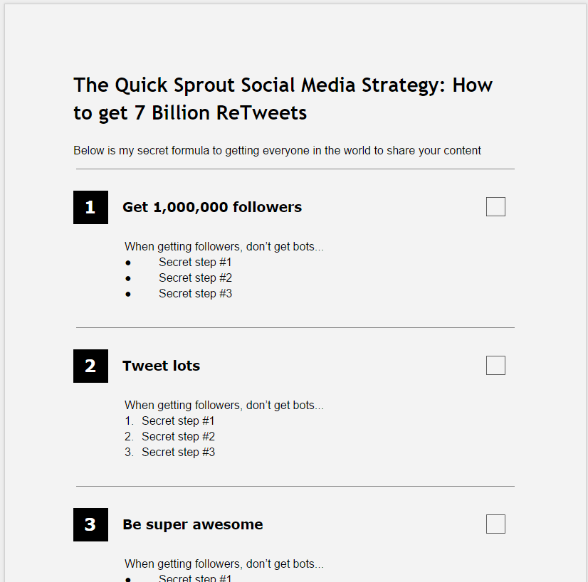
Pair that with a great cover, and you have a product people are thrilled to give you their email addresses for.
8. The truth about pop-ups
Pop-ups are an amazing way to increase your email sign-up rate, but they can also easily piss off your visitors if you’re not careful.
The average pop-up conversion rate is 1.66%. That’s pretty good for an average. If your blog has a low to medium amount traffic, you should be able to achieve at least double that number after some optimization.
But you might be scared that pop-ups will make your visitors instantly hit the back button on their browsers. You don’t need to be.
Some blogs find that pop-ups don’t change their bounce rate or the average time spent reading a post.
What that says is that when implemented correctly, pop-ups aren’t annoying enough to scare away interested readers. They may scare away people who didn’t really want to read anyway, but that’s not a big loss.
The question then becomes: how do you use pop-ups correctly?
It comes down to 3 factors.
Factor #1: Time until pop-up is displayed
Some readers, even if they’re loyal fans, will immediately close the window if they see a pop-up right away.
One test found that the optimal time to show a pop-up was at 10 seconds after the page loaded:
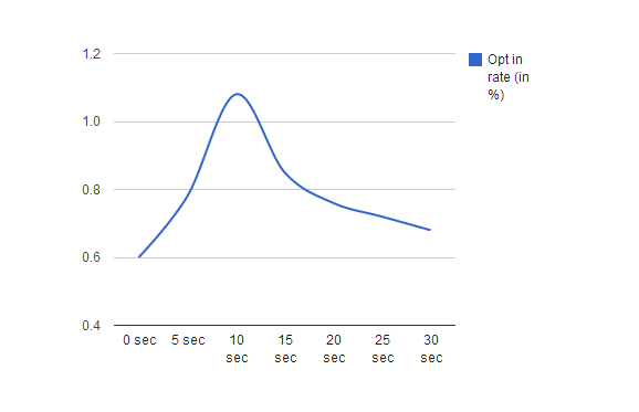
These are the results that you would expect. If you get surprised the second you walk in the store, you leave.
But you must test this on your own site.
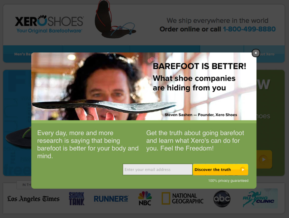
Another option that can work great is to display the pop-up only when someone is about to close the page or tab in their browser. This is called exit-intent technology, and it is usually a premium feature of pop-up software.
XeroShoes used exit-intent activated pop-ups and were able to increase their overall opt-in rate by 2.5%.
Factor #2: Frequency
If you really want to scare away your readers, show them the same pop-up every time they load a new page.
With all pop-up software, you can set a cookie for a certain length of time. As long as a visitor doesn’t clear their cookies, they won’t see another pop-up on your site for that length of time. If you set it for at least a week, you should be fine.
Factor #3: Ease of closing
This is arguably the most important factor. If you make it difficult to close the pop-up, people will abandon your site in droves.
It’s not always on purpose, but any pop-up with only a small hard-to-see “x” will be hard to close. It’s mainly because readers can’t find the button.
Even worse, some pop-ups have no obvious close button at all, only a hard-to-read link.
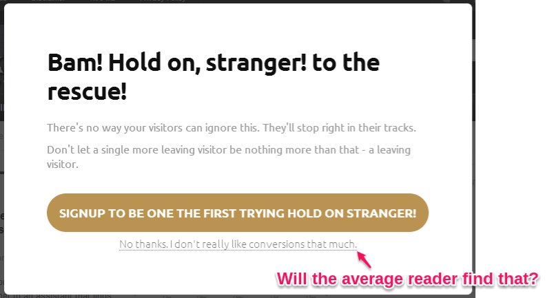
Not only are these links hard to close on desktops and laptops, but they are often nearly impossible to close on mobile devices. If your blog has a large mobile audience, double-check how your pop-up shows up on mobile devices.
A safer alternative: Slide-in forms
If you’re really against pop-ups, which we do understand, you can still harness a lot of their power with slide-in offers.
Once you scroll down a certain amount, a nifty little pop-up in the bottom right corner slides in displaying whatever text or links you choose. They only take up a fraction of the screen and don’t interfere with reading the post. However, because they move, they still draw attention based on pattern interruption.
The best example of these are on HubSpot blog posts.
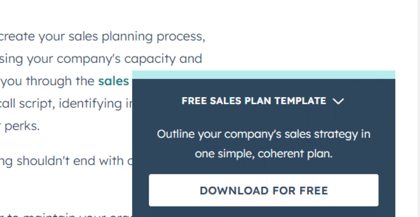
When HubSpot first tested these slide-in forms against their standard static form at the bottom of each post, they found that the slide-in forms increased their conversions by 27%.
But be careful: these can also be a pain on mobile devices, so check them too.
9. Designing a high-converting opt-in form
Regardless of whether you’re designing a static opt-in form or a pop-up of some kind, you have to apply the same principles if you want to create an opt-in that converts well.
In general, you have to consider three essentials factors: your offer, your headline, and your call to action (CTA).
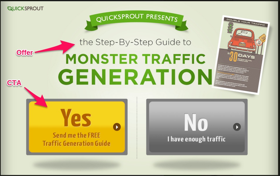
Factor #1: A valuable offer
There’s a reason that this was the first point we looked at in this article. You need something that your readers will care about enough to give their email addresses for.
Factor #2: A clear headline
This is simple but important. This is not a typical headline where you might incorporate clickbait tactics. Clearly state the title of your lead magnet, possibly preceded by “Download”, “Get a copy of”, or a similar phrase.
Factor #3: A first person CTA
First, you need a CTA. Once your visitor inputs their email address into the text form, tell them what to do to get their freebie.
To boost your conversion rate, write your CTA in the first person.
Try to write your button CTA in terms of the benefit your offer will provide. For example:
- “Yes, I want more traffic”
- “Show me how to get more subscribers”
- “Give me your secrets”
On Social Triggers, Derek Halpern swaps the traditional close “x” for an entire close button. Instead of hiding it, he uses first person CTAs for both the yes and no buttons.

Notice that in order to close the pop-up, you have to read “I reject the free e-book”, which sounds silly if you say it to yourself. This is just the latest test in a series, but we suspect it’s performing quite well.
10. The most effective email collecting tools
If you want to use a static opt-in form, you’ll need to have a developer design it, or you can modify templates provided by your email marketing provider (Aweber, MailChimp, etc.).
But the most effective email collecting tools by far, as we’ve seen, are pop-ups. To implement them on your site, you will need to use a specific tool designed for this purpose.
To cover all price ranges, we’ve chosen three options that work with WordPress. Be aware that as the price goes down, the amount of work you have to do typically goes up, and the tools become less convenient.
Option 1: Hello Bar
Hello Bar offers a lot of features to capture more emails.
Cost: The free plan covers most features.
The pop-ups that this product makes are very simple and minimalistic. That being said, they’re fairly attractive and non-intrusive.
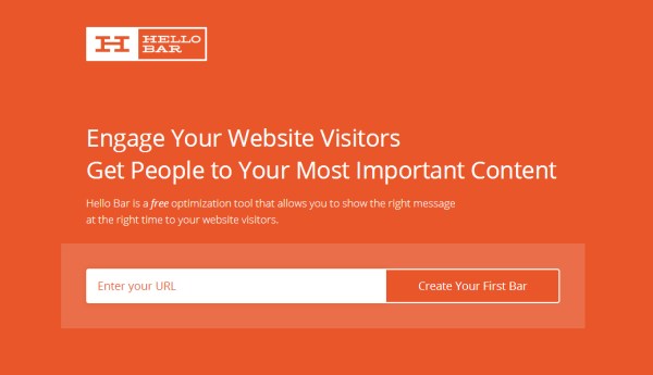
The neat thing about this tool is that we use on our blogs. It’s how we were able to grow them to over 100,000 subscribers.
Option 2: OptinMonster
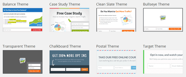
Created by Syed Balkhi and Thomas Griffin, OptinMonster is an affordable mid-range pop-up tool option.
Cost: Minimum $9/month for basic features.
You can quickly create a pop-up using any of the several templates available. In addition, you can also do A/B testing, which is a great feature.
Option 3: Leadpages
It’s one of the most comprehensive email collection tools out there.
Cost: Minimum $37/month for basic features.
Leadpages software is very well designed, but it costs a lot more than other pop-up options because you’re paying for other features as well.
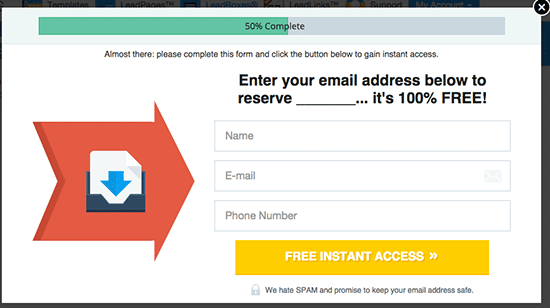
Originally, Leadpages existed to help you create high-converting landing pages. They only expanded to pop-up technology once they saw the need for it.
If you go with the basic plan (you can’t just get the pop-up tool on its own), you also get unlimited landing pages. If you have many domains or regularly create landing pages, it’s a solid option.
11. The best places to ask for email addresses
There’s one last piece of the puzzle missing: where to ask for your readers’ email addresses.
The traditional way is the sidebar. You don’t need a sign-up form in the sidebar. Most forms placed there will get a subscription rate of about 0.4%. Even a well done sidebar form only converts at about 1%.
We’re not saying you can’t have one, just be aware that it isn’t really necessary and will only make up a small fraction of your signups.
Option 1. The Home page
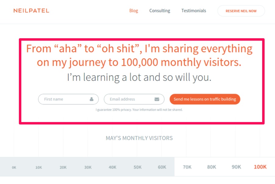
A large portion of your traffic will end up on your Home page. Most of that traffic will come from other parts of your website, which means that the visitors were interested in exploring it further.
These readers can be converted very easily with a “feature box.” A feature box is simply a large area near the top of your homepage that stands out and clearly asks for a reader to opt in.
Option 2. In blog posts
Most of the traffic a website gets is to individual blog posts. So, it makes sense to ask for email addresses there.
The problem with sidebar forms is that they are often ignored. But content isn’t.
If you make your offer somewhere within the content, it will get seen more often and convert higher.
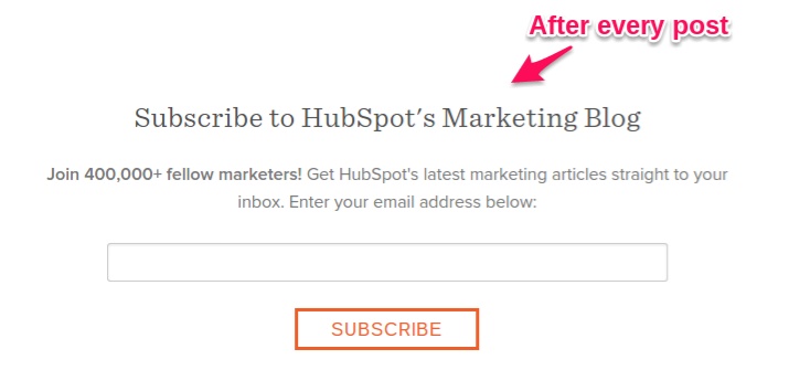
The first place to start is after your post. If someone reads it to the end, they are clearly interested in what you have to say. This makes it the perfect time to offer them something more, whether it’s more content or some sort of bonus.
But you don’t necessarily have to wait that long to ask for a signup. You can configure your pop-up to show up after a certain amount of time, or you can simply use a link in the content to trigger your pop-up manually:
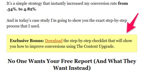
This way, you can mention your bonus when it’s most appropriate.
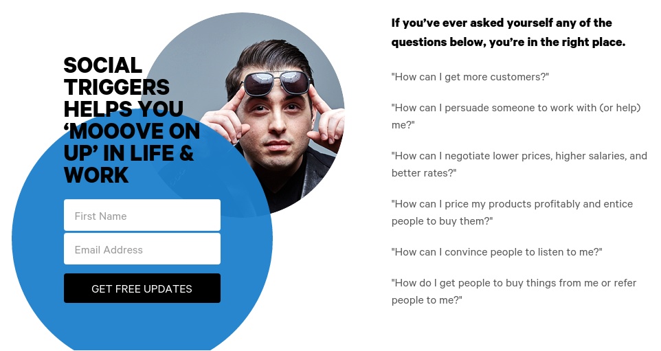
Option 3. The About page
Look at your site analytics. The About page often gets a significant amount of traffic.
Like with the Home page, anyone who navigates to your About page usually likes what they’ve read. They’re just looking for some more background on you and the site to make sure you’re credible.
This is a great time to ask for their email address. In fact, often you don’t even need to offer anything other than your content and expertise in order to get high conversion rates.
12. Understand the two biggest factors behind opt-in rates
At this point, you understand most of the best practices when it comes to thinking of lead magnet ideas and creating them.
But those are just tools you can use.
If you really want to achieve great opt-in rates (like bloggers who get 10-20% rates), you’ll need to truly understand why people opt in to your list.
And it all comes down to two important factors.
Factor #1 – Relevance
If we’re reading a post about social media marketing and someone offers us a lead magnet on yoga poses, we’re probably not going to be interested in it.
Now that’s an extreme example, but let’s look at a more realistic one.
Maybe you’re reading a post about SEO, and there’s an e-book offer for a social media traffic generation strategy.
You are interested in getting more traffic, but at this point, you’re likely most interested in getting it from SEO.
So, some readers of that post will opt in for the lead magnet, but not a very high number.
But what if you were offered an e-book (or other lead magnet) about SEO while you were reading that post about SEO?
Of course, you’d be interested!
This is called a post-specific lead magnet, which is also called a content upgrade.
By making lead magnets for each post (or each topic) you write about, you dial up the relevance of the offer.
Bryan Harris has reported getting opt-in rates of 20-30%, and sometimes of up to 62%, using content upgrades.
Factor #2 – Value
Just because you’re reading a post about SEO, and the bonus is about SEO, doesn’t mean you’ll get a ton of opt-ins.
Why? Because your offer might not be valuable.
If it’s a list of “SEO basics,” not very many readers will care enough to give you their email addresses for it.
On the other hand, if you reveal a secret link source or tactic, readers will place a ton of value on it, and you’ll get an extremely high opt-in rate.
The more valuable your reader thinks your bonus is (before they even see it), the higher your opt-in rate will be.
If you follow the first five steps in this post, your lead magnet will be highly valuable to your reader.
Conclusion
Lead magnets are a very powerful tool to collect information about your readers.
You can then use that information (mainly the email address) to build a relationship with readers that will eventually turn some of them into customers.
But if you approach lead magnet creation half-heartedly, you won’t get high opt-in rates.
Optimizing your email opt-in rate is not easy—we never said it would be.
But those of you who take the concepts and strategies in this article to heart—and apply them—will get rewarded.
If your blog gets 10,000 visitors a month, even a modest 2% increase in your email opt-in rate would be an extra 200 subscribers a month, or 2,400 a year.
If you treat your list right, that could easily be worth over $10,000.
That should really be the only incentive you need to spend a few hours evaluating your current set up and improving it.
Remember to use your judgement.
Always consider how your audience might react to any specific tactic you implement, and test!
Find what works on your site using the guidelines we’ve given you in this post.
