Why are you spending all this time and effort to get visitors to your website only to let them leave after the first or second page they see?
It’s much cheaper to get a visitor already on your site to go to another page than to attract a new visitor.
Guess what? It’s more valuable too. If a visitor is checking out several pages, they might like you. Each post or page they read will increase brand recognition and trust, which will lead to conversions down the line.
Wouldn’t you be interested if we told you that you could double, triple…or even quadruple the average number of pages viewed by a visitor?
Assuming you haven’t spent a ton of time optimizing your user experience (UX), you can see crazy results from a bit of work.
This post will show you the 5 most effective ways to improve your UX, leading to an instant boost in page views.
User experience is not art—it’s science
The thing that prevents website owners from UX optimization is that it sounds like a complicated thing.
It’s something that you might think that only developers understand.
But in reality, it’s pretty simple and requires no specialized knowledge. Sure, getting experience will help you see results faster in the future, but anyone can start improving the UX of their visitors.
First off, what exactly is user experience?
It’s a broad term, which can lead to confusion. The user experience encompasses all parts of how your website’s content affects someone’s visit. It’s best summed up in the Morville honeycomb:
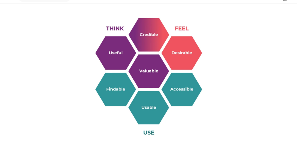
There are seven distinct keys to a good user experience:
- Useful – Your content must accomplish something.
- Useable – Content should be practical, and tools must work as intended.
- Desirable – Users need/want what you’re offering.
- Findable – Not only should your original content be findable, but your other content should also be easily findable (good navigation).
- Accessible – If visitors can’t access your content (pop-ups, overlays, poor loading, etc.), they won’t have a good experience.
- Credible – Users can only have a great experience if they trust what they’re reading/using.
- Valuable – Your website must accomplish something people value (essentially an extension of usefulness).
The five ways of improving UX we’re about to show you fall into one of these seven categories.
A final important thing you need to know is that user experience is unique to each individual.
Sometimes, two sites can make the same change, and the UX on one site will improve but get worse on the other. It depends on your visitors.
What that means for you is that even if you agree with something we show you in this post, test it on your website to see if it’s actually going to be a positive change.
The UX is not an opinion. It should be backed by data from real users.
1. Links are not just for SEO—they’re for users
Too often, site owners make the mistake of making changes and marketing decisions based on how they think search engines will react.
We’ve been guilty of this in the past. Almost everyone has.
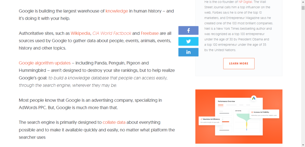
When you put a link in an article, it shouldn’t be just because you read that Google rewards content that links out to authority sites. Instead, it should be because it adds value for your visitor.
Have you seen how much we link Quick Sprout and NeilPatel.com posts?
Why are links good for UX?
- Links can answer questions: If it’s a really common question, you might write a paragraph on it. But if you think only a minority of your readers might ask it, you can include a link just for them.
- Links logically lead readers to the next step: When you write something, you must pick a scope (what you will cover). Even if a related topic is really interesting, you might not have the space to cover it. Instead, a link can connect the reader to another article, allowing them to continue exploring the topic.
- Links build trust: Remember those seven factors of UX? Credibility was one of them. Links to sources and resources in a data-driven post make readers feel more confident about the information you are providing.
If you include the right links, you can let users customize their experience, which is always positive.
There’s one more thing we need to talk about…
Should you include internal links or external links: I’ll make this as simple as possible. Always link to the most valuable resource for your visitors, whether it’s on your site or someone else’s.
Note that other articles on your site often hold the most value if they are highly relevant because the reader is already familiar with your work and likes it enough to read the current article.
Internal links obviously increase the number of pages visitors will see on your site. A new site won’t have much valuable content to link to, but a site that’s been creating content for years (e.g., Quick Sprout) will have tons of related content to be linked to in each post.
As we mentioned earlier, external links might help you appear more trusted to search engines. That’s a small potential benefit.
The real benefit is that if you link to a great resource, your visitor will associate that with you (you just did them a favor). This leads to more trust and more loyal readers. This is why it might not be the best strategy to link to the first resource you find on Google. Dig a bit deeper to find something really valuable.
Finally, remember that each separate link won’t be clicked very frequently (usually 1-10%). But all of those links add up. If you add 10 extra internal links to a post, you’ll likely get an average of 10-20% pageviews from a visitor.
That’s a big difference. Imagine going from your regular 10,000 page views per month to 11,000 or 12,000, just from one simple change.
2. Some of your visitors are turtles
Our super long posts (5,000 words or so) typically have many pictures.
We include images for various reasons, but mainly to break up content to make it more readable.
We can only do this because most of our blog visitors use a desktop/laptop. Think about it: Who has the time to read 5,000 words on a phone’s screen?
The reason we mention this is because mobile and desktop browsing differs not only in screen size but also in speed.
Most people using computers can download a few hundred kilobytes or even a few megabytes in less than a second.
The same can’t be said about mobile phones. Mobile connection speeds ranged from 0.6 Mbps to 9.5 Mbps. Clearly, some mobile users will be able to load your site quickly, but many won’t.
Most phone users accept that their Internet browsing will be a bit slower than normal, but not as much as you might think.
A reported 83% of consumers expect a web page to load in under 2 seconds. But those are desktop users.
Phone users expect pages to load in under one – 2 two, so there’s a bit more leeway. But the average site loads in nine seconds on mobile, which isn’t even close to good enough.
This is a problem because a slow-loading page isn’t just annoying—it will turn visitors away from your content. Forty percent of visitors will leave your site if it takes longer than 3 seconds to load (on desktops). You can extrapolate that to 6 seconds for mobile users, which still is less than the average speed of a mobile site.
The problem with page speed tests: Many website owners have already tested their websites for page speed and found no problems. Unfortunately, there’s a flaw with the average page speed tester.
Most popular page load speed tests (e.g., GTmetrix, Pingdom) use an unthrottle connection by default. This takes connection speed out of the equation and looks solely at the technical side.
Now, that’s important. That’s how you see if you have any major speed issues. The problem is that the page load time you get with such tests only represents a fraction of your users (even if it’s a fairly big chunk).
Consider this: We tested Quick Sprout on GTmetrix with the standard default settings. It passed with flying colors —nice.
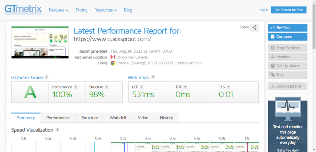
You can also create a free account and then change the connection speed to 4G slow speed, which is what a large portion of mobile users are still stuck on (75% of users).
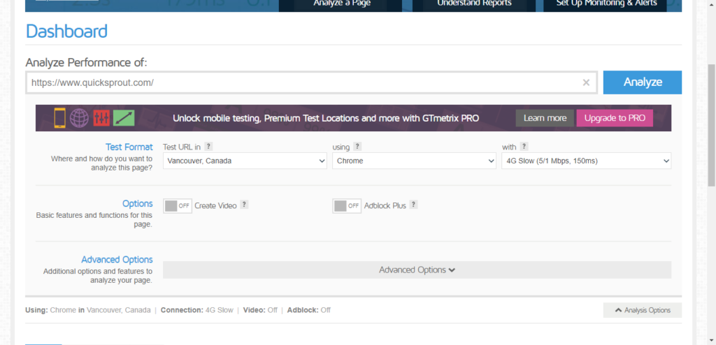
When we run Quick Sprout through the test again and get a very different loading speed: 416 mili-seconds.
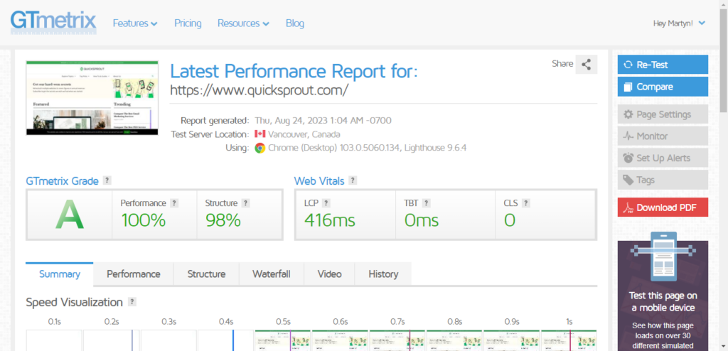
If you run this test for other pages, you will often see the load times more than double. This means that narrowly beating that original 2-second limit is not enough.
We’re not going to write a full guide to page speed optimization here, but we’ll address the most efficient ways to optimize your site for mobile users.
Factor #1 – HTTP requests: One of the main metrics that any page speed tester will show you is the number of HTTP requests made.
An HTTP request is made to get the information for each script, image, CSS file, etc., within the HTML. Each request takes time to process. About 80% of the time is spent making HTTP requests when loading a page.
You can speed up your sites by reducing the number of HTTP requests a browser needs.
How do you do this?
The easiest way is to consolidate CSS files and images as much as possible. It’s not uncommon for a poorly-optimized WordPress theme to have three or more CSS files requested together on the same page. Copy all the CSS files into a single file, and edit out any references to the now deleted files.
Most sites also have the ability to decrease the number of requests by creating CSS sprites. Sprites are image files that contain multiple images inside them. The CSS code tells the browser which image is located where.
Sprites should be made for all images that are called on every page, such as navigation images or logos.
To make this easy, use a tool such as Sprite Generator. Simply drag and drop your images onto the canvas provided. The CSS with location details will be created automatically.
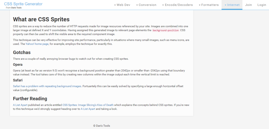
When you’ve added all your common images, you can download your CSS sprite (at the top) and then call that in your pages instead of multiple separate images.
The above were two quick ways to eliminate several HTTP requests on most websites, but there’s more to it than that. Here’s a slightly more thorough guide for more information.
Factor #2 – Page size: The other main metric measured with a speed tool is the page size in bytes. Ideally, your page shouldn’t be more than a few hundred kilobytes (sometimes, it’s unavoidable to go over).
If you’re having big page speed issues, you may have to reduce the number of images you use, but you can do a few things before then.
First, compress your images. Most image files have useless metadata that takes up a lot of space. Use a tool like Optimizilla or a WordPress plugin like WP Smush to reduce file size.
Second, use HTTP compression to compress the size of files as they are transferred. The most common form of HTTP compression is GZIP. Check the GZIP option in the W3 Total Cache plugin to use GZIP compression in WordPress.
Finally, simplify your site as much as possible. Don’t include an excessive sidebar or tons of images in your header. Stick to simple text and HTML as much as possible.
Factor #3 – Hosting and delivery: Even if you do all that technical stuff right, visitors may be unable to load your pages fast if your hosting and delivery sucks.
The hosting part is pretty simple. If you pay $5 monthly for a shared plan, your site will never be very fast. Get on a serious hosting server dedicated to your site unless you are just starting.
We recommend using a content delivery network (CDN) for static files such as images. This will cost you more, but your website will grow faster, and visitors will convert better, which is worth it. Here’s a guide to choosing a good CDN.
Bonus Tip – trick your users into being more satisfied by dialling up the relevance: When residents in a building complained that waiting times for elevators were excessively long, instead of speeding up the elevators, the building owners gave the residents something that could occupy their time while waiting. The building manager installed mirrors so that the residents could look at themselves while waiting, and the complaints stopped.
While it’s not a perfect analogy, waiting for a page to load could be as frustrating and boring as waiting for an elevator to arrive. Visitors realize that they are sacrificing their time for content. The more they enjoy your content, the less they will mind waiting. We suspect that many of our readers, like you, would wait longer than 2 seconds for a new blog post to load.
“If users cannot find what they want on a website, they will regard the download time as slower than it actually might be. Conversely, if users find what they want on a website quickly and easily, they perceive the download time as faster than it might be. We have observed these perceptions consistently during usability testing for over 10 years.” – Shari Thurow
What does this mean for your site?
It means that including a table of contents to help your visitors find the answers they’re looking for, writing a highly relevant meta description, and highlighting important parts of your post can make your readers feel that waiting for the page to load is worth their time.
A happy reader is much more likely to click on other links to posts on your site than a frustrated reader.
3. Your message comes first, so eliminate distractions
Your message must be front and center on a landing page or a blog post.
It’s what your visitors are there to read. This falls under multiple UX categories but mostly accessibility.
If you make content easily accessible, readers will continue to read. If you make it difficult, many will either leave right away or not be excited to visit another page on your site.
Although sites vary in their designs, there are 3 common sources of distractions that most sites have that should be eliminated.
Here’s how to fix them…
Tactic #1 – Minimize or eliminate the sidebar: The sidebar is neglected on most blogs. You need to put a lot of thought into what you put into your sidebar, or if you even need one at all.
Medium is currently one of the most popular blogging platforms, renowned for being highly readable. There is no sidebar on a Medium post—just content:
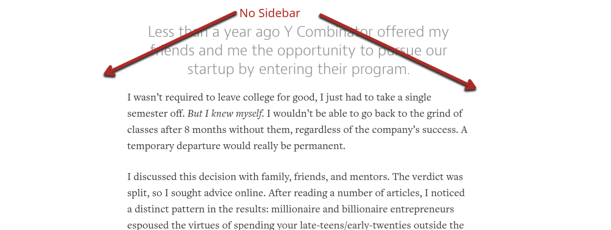
The no-sidebar layout has zero distraction, so the reader focuses solely on the post.
Others using this layout have been able to increase not only their page views but also their conversion rates by 26-71%.
This can be a good thing, but sometimes you want to show your readers certain elements of your site every time they visit, even if it might distract them a bit.
If you do continue to use a sidebar, only include the most important information in it, such as:
- Opt-in
- Bio
- Links to top posts
- Links to products/service
That’s what we do on our blogs:
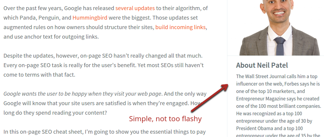
Notice we don’t have anything flashy in the sidebar. Readers know it’s there, but they can focus on the post content if they aren’t interested in the sidebar information.
Tactic #2 – Think about dropping scrolling elements: This is tricky. Having parts of your page that are fixed and scroll down as the user scrolls down can improve conversion rates. But if you go overboard, it will have a negative effect on UX.
You need to test any scrolling element you add. Compare before and after metrics for time on page and pages per visitor to see if it’s worth it.
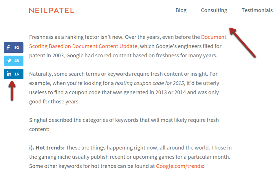
We use some scrolling elements, but not a lot. See how the top menu scrolls down with the page on NeilPatel.com:
Alternatively, we have the thin Hello Bar on Quick Sprout.
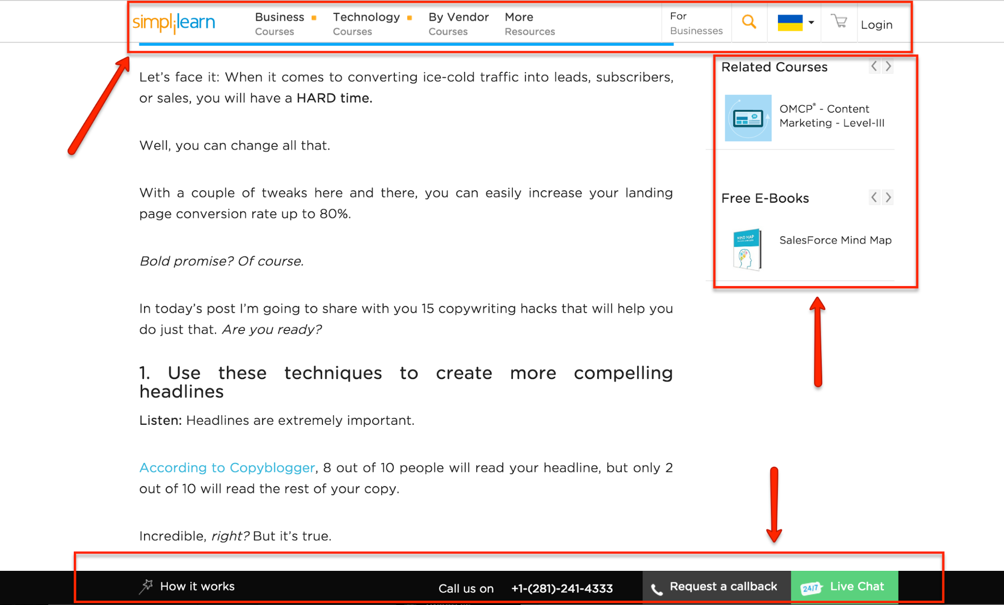
Notice that the elements aren’t highly distracting in both cases and only take up a small part of the screen.
But when you start adding a scrolling header, footer, social sharing buttons, or sidebar, it can get busy quickly. A page like this will turn off many readers, no matter how great the content is:
Tactic #3 – Delay or get rid of pop-ups: Another sensitive subject—pop-ups—are great for improving your email opt-in conversion rate. But they also annoy users, which can lead to a lower number of pages per visitor.
We’ve tried using pop-ups on Quick Sprout in the past and have gotten good results from a conversion standpoint:
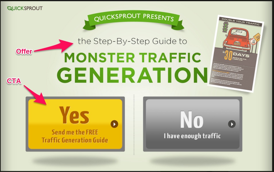
If you’re going to use pop-ups, limit their detrimental effect on your UX.
Don’t have them pop up as the page loads because that’s a sure way to scare off visitors. Instead, wait at least 10 seconds—60 seconds might be better.
The longer you wait before showing your pop-up, the less annoying it is. If a reader has already been reading for 30 seconds to a minute, asking them to close a simple box isn’t too much.
4. Consistency is more important than creativity
In order to be credible, your brand must be consistent.
In order to be usable, your layout and content must be consistent.
When visitors return to your site at least a few times, they should know what to expect. If they want to find blog posts, they should be easy to find. If they want to hire you, the same thing: getting in touch with you should be easy.
There are two main factors to consider regarding consistency and UX.
Factor #1 – Branding and Symbols: Your brand is defined by many different things, mainly by your logo and symbols.
When we talk about symbols, we’re talking about things like Google’s hamburger menu:
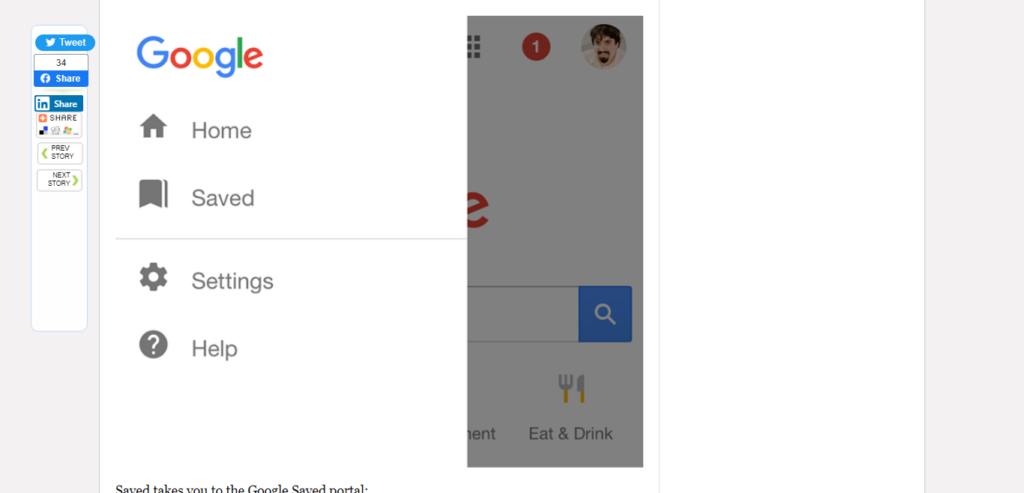
This symbol indicates a menu with settings in it across Google products, including Chrome and almost all Android applications. When a Google user looks for settings, they look for that hamburger menu.
Whatever your product is, you should use the same symbols and terms across all forms of communication: your blog, landing pages, emails, and the product itself.
Take a look at the branding on Quick Sprout. You start to recognize the logo and color scheme after a while:
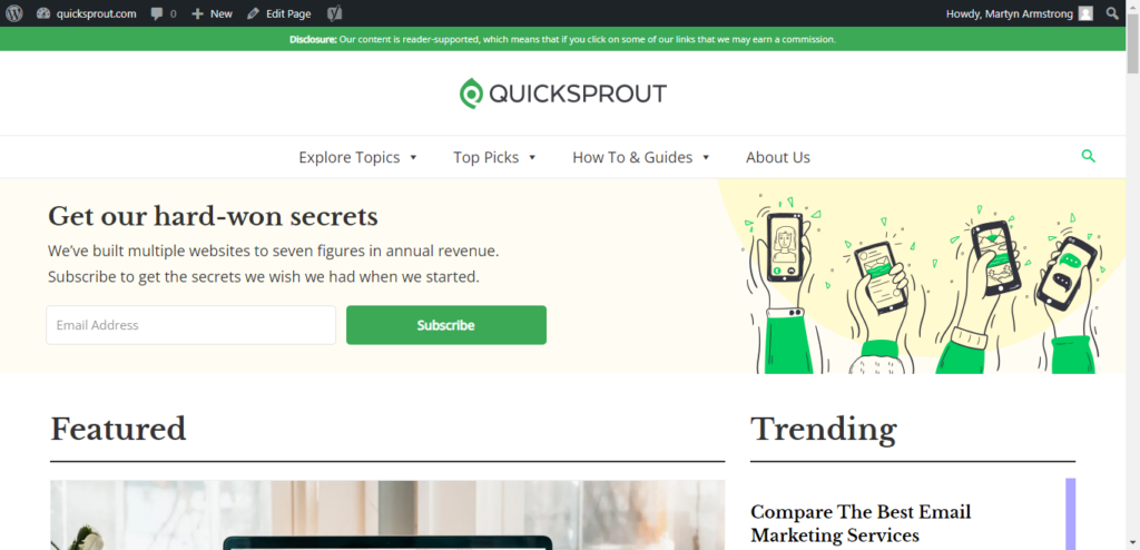
If you go to a Facebook page, you see the exact same logo and color scheme:
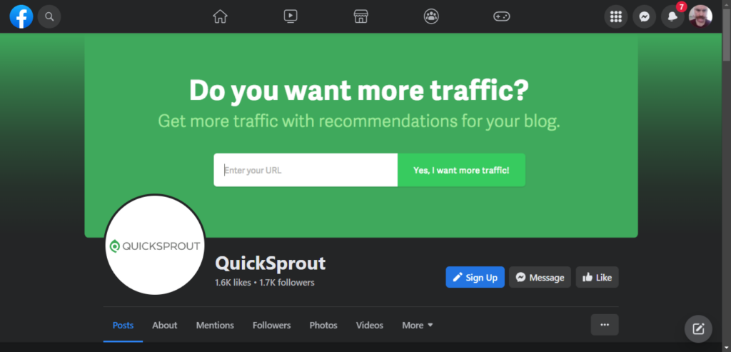
But imagine if you went from the Quick Sprout blog to a landing page that had a different logo and a different color scheme. You’d feel there’s something wrong here and likely close the page—credibility lost.
All your blog posts and site content should look like they belong together.
Finally, you can make it even clearer for your readers if you use icons and symbols relevant to their function.

Icons might stand alone or be incorporated into a picture/link.
For example, if you’re linking to a tool like Quick Sprout in the sidebar, you could include a magnifying glass.
Or, if your blog excerpts say “read more,” as many do, you can include an arrow right after, indicating that there is more to come.
Factor #2 – Style: Style does include a color scheme, but it is more than that. You also need to consider font type, size, layout, writing tone, etc.
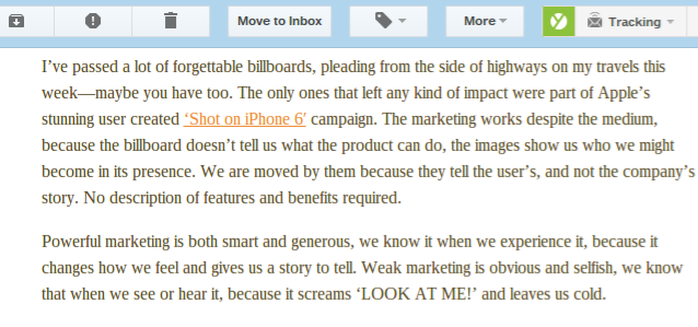
Someone who maintains a consistent style really well is Bernadette Jiwa, a copywriter. She formats her posts the same way she formats her emails (post below):
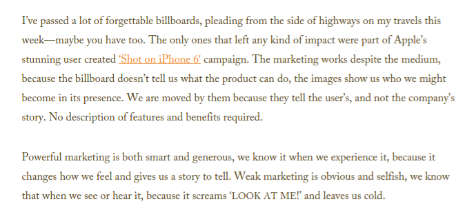
The emails have the same colored links, same text size, and same font:
Consistently help your readers know what to expect, improving their UX, no matter the platform.
If you’re on our email and blogs, we bet you’ve noticed something about our emails: they’re all laid out exactly the same.
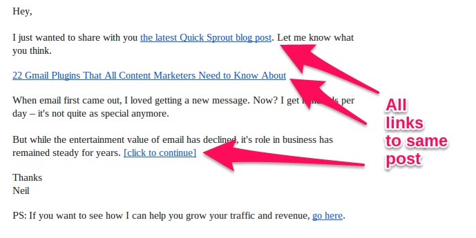
There’s a link with the anchor text “the latest (site) post” in the opening line.
After that, there’s a standalone link to the post with the post’s title as the anchor text.
Finally, we give you a quick introduction to the post plus another call to action to go read the post.
After a few emails, you’ll pick up on this pattern and know what to expect. This is good for us and you. It’s good for you because you know exactly what to expect and how to get to the content if you want it. The reason is that we know that you know (stay with us) that you can get to the new post from any of those links.
What would happen if, in some emails, we included only the first link and, in others, only the last link? You wouldn’t know what to expect. Sure, a large portion of the readers would still find the link, but others would scroll right by the first one at the top or not see the last one at the bottom.
5. Make important elements BIG
No, we’re not just talking about making opt-ins huge. When we say “BIG,” we’re talking about visibility.
In order for content to be as usable as possible, readers need to be able to identify the most important parts easily.
Here’s what we mean: Look at any site with a great UX, and there will always be a focal point on any page:

In this case, it’s an email opt-in box. Although a large picture and menu options exist, color and size have been used to make the opt-in box stand out.
Here’s another example:
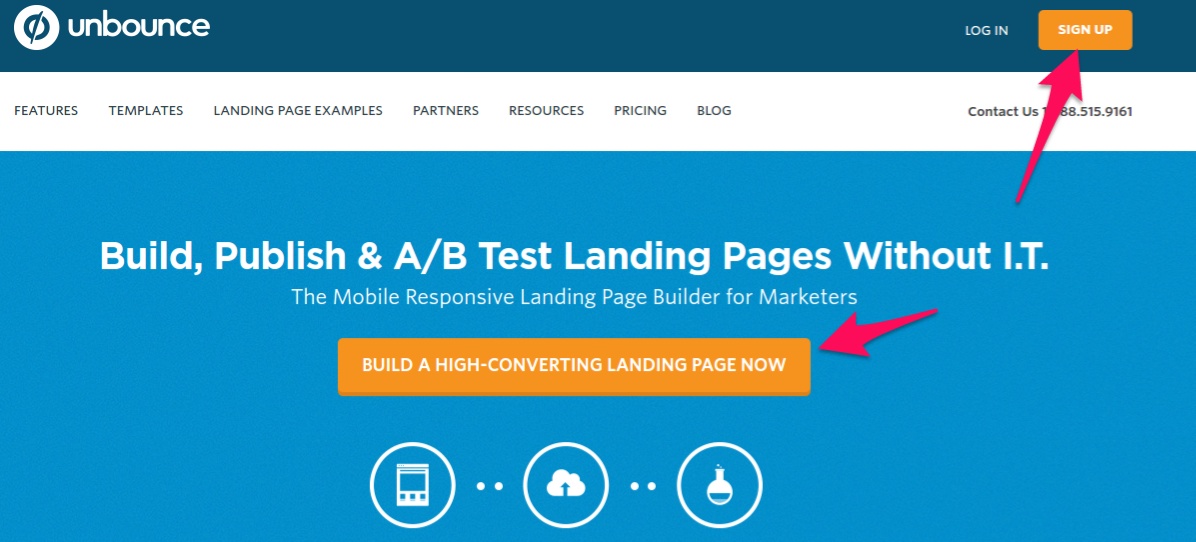
Unbounce made their sign-up buttons highly visible.
Both of these examples show the power of contrast.
If you want something to stand out from the rest of your web page, give it a drastically different color—it will get attention.
But making things more visible is important for other goals, not just email sign-ups or account creation.
Consider links within your content. These should be easy to see and click (use).
Some sites hide their links in grey or don’t underline them, thinking readers will click on the links and never return. You and I know your readers will always return if your content is great. Plus, the other benefits are discussed in this article’s first section.
On NeilPatel.com, for example, links are displayed as bright and highly visible orange text. In addition, we use a fairly large text size. Even on mobile devices, links are easily visible and clickable:

Considering that many of these links lead to other pages on the site, it’s a good thing when visitors are interested in them, so why wouldn’t you want to highlight them?
The orange links are another example of using contrast for a different purpose.
You can also make elements stand out by emphasizing them. This can be done by separating them from other elements (adding more white space), using a unique font, or using bold or italic effects.
For example, Brian Dean at Backlinko uses a special yellow box to highlight his content upgrades. Plus, he bolds the first few words to make them stand out:
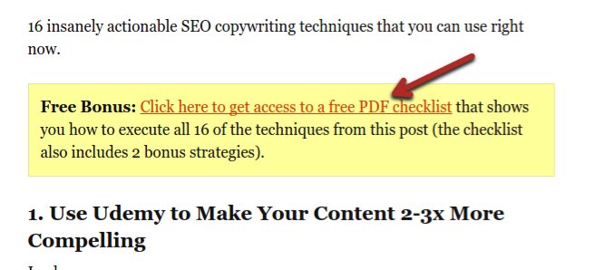
Quickly identifying what a user is looking for is key to usability. We recommend getting new visitors to your site and tracking their mouse movement with software like Crazy Egg.
By looking at where most of your readers’ attention goes, you can see what naturally stands out to them when they visit a page. Then, you can adjust your elements and test the difference until you achieve the desired effect, e.g., directing your visitors to an opt-in, link, or specific content.
Conclusion
For all the time you spend building traffic, you owe it to yourself to spend more time optimizing the user experience.
If you implement at least a few of the methods in this post, you can raise your pageviews by a large chunk.
If you currently get 10,000 monthly pageviews, what do you think is easier: get an extra 3,000 visitors or increase the number of pages an average user visits by 30%?
In most cases, the second option is way easier.
Keep in mind, however, that optimizing UX is not an overnight process. Remember that you need to split-test any changes you make and make iterative improvements until you give your visitors exactly what they’re looking for.
We challenge you to continuously think of, test, and evolve your website’s UX as your brand grows.
