When did you last take a long, hard look at your landing pages?
On paper, landing page optimization seems easy enough. In fact, you’re probably following some formula to design your landing pages.
Follow a few basic principles, capture the attention of your visitors, put to rest any doubts they may have, urge them to purchase, and let the money pour in.
Right?
In reality, it’s not this easy.
Our experiences with landing pages have taught us that designing the perfect landing page is hard work.
There are principles to follow, sure. But there’s also a lot of information you need to gain before you can design that killer landing page.
- What are your customers thinking?
- How did they find your landing page?
- What headline is going to grab their attention?
- What device are they using?
- What pain are they experiencing?
- What’s going to make them convert?
That final question—what will make them convert?—is the most important one.
Do you want to know what we really care about landing pages?
Conversions.
We want more conversions.
You probably do too. According to the studies, “only about 22 percent of businesses are satisfied with their conversion rates.”
Let’s get to the point. Here are 10 landing page tactics we’ve had immense success with that can help convert even casual visitors into customers.
1. Keep it minimal
The “less is more” idea rings true throughout many aspects of marketing.
Science and research have shown that this minimalist mindset and strategy lead to breakthroughs in life and business.
What Minimalism is really about is a reassessment of your priorities so that you can strip away the excess stuff—possessions, ideas, relationships, and activities—that don’t bring value to your life.
What’s true in life is true in digital marketing too.
Tommy Walker’s expert article, “Why ‘Simple’ Websites Are Scientifically Better,” tells exactly why and how the mind responds to a simple, minimalist website.
Your landing page is no exception.
The simpler, the better.
Saturate your landing page with many unnecessary extras, and you’ll be sure to distract and confuse your visitors.
One area where marketers often go wrong is multiple offers. In fact, 48% of landing pages contain multiple offers.
However, multiple offers can decrease conversions by 266%!
That means you need to keep things relatively sparse and avoid giving your visitors a cognitive overload.
Take a look at this example from Vimeo:
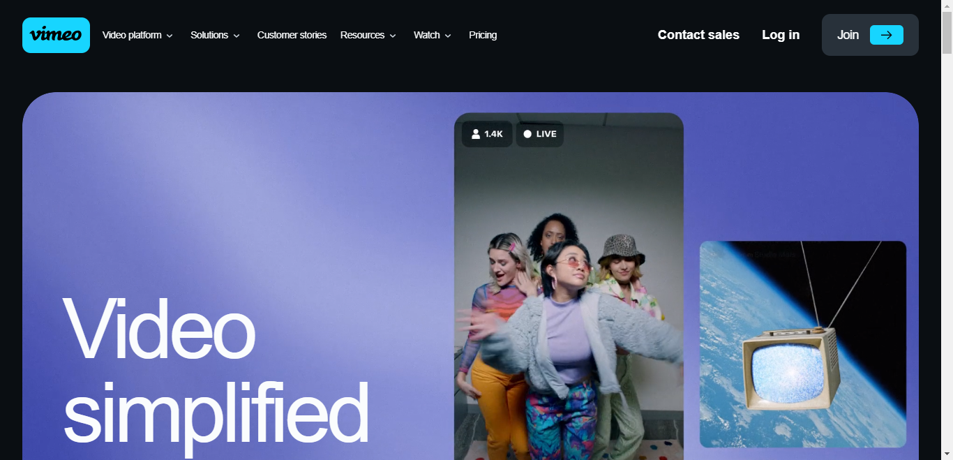
It’s elegant and user-friendly, right?
This landing page for Vimeo Business wants you to do one thing and one thing only: Get Vimeo Business.
There is no doubt what your next action should be.
- If you are a wallet-out-ready-to-buy customer, you’ll click the green CTA.
- If you’re the I-need-to-do-a-little-more-research kind of customer, you’ll watch the video or scroll down.
Either way, Vimeo’s got you hooked.
Why? This is a minimalist landing page with zero clutter, zero friction, and zero hurdles to conversion.
Avoiding complications and excessive choice will help your visitors maintain better focus, which is a surefire way to boost conversions.
2. Use the five-second rule
The pop-it-in-the-microwave culture we live in means one thing for landing pages.
Stuff happens fast.
Instant engagement is essential, and you must get straight to the point.
That’s why we like to treat it as if there are only five seconds to capture the attention of new visitors.
How do you achieve this?
This goes back to the first point about taking a minimalist approach. Often a snazzy headline, an image, and a CTA are all it takes.
Also, keep key benefits above the fold so that visitors can be persuaded to buy without having to scroll down.
Craig Tomlin, a usability expert, explains why five seconds matter:
The reason five seconds is so important is because of research studies which demonstrate that visitors to websites take a very short amount of time (in some cases a fraction of a second, as little as 50 milliseconds) to judge the quality of a website.
What about those “research studies?”
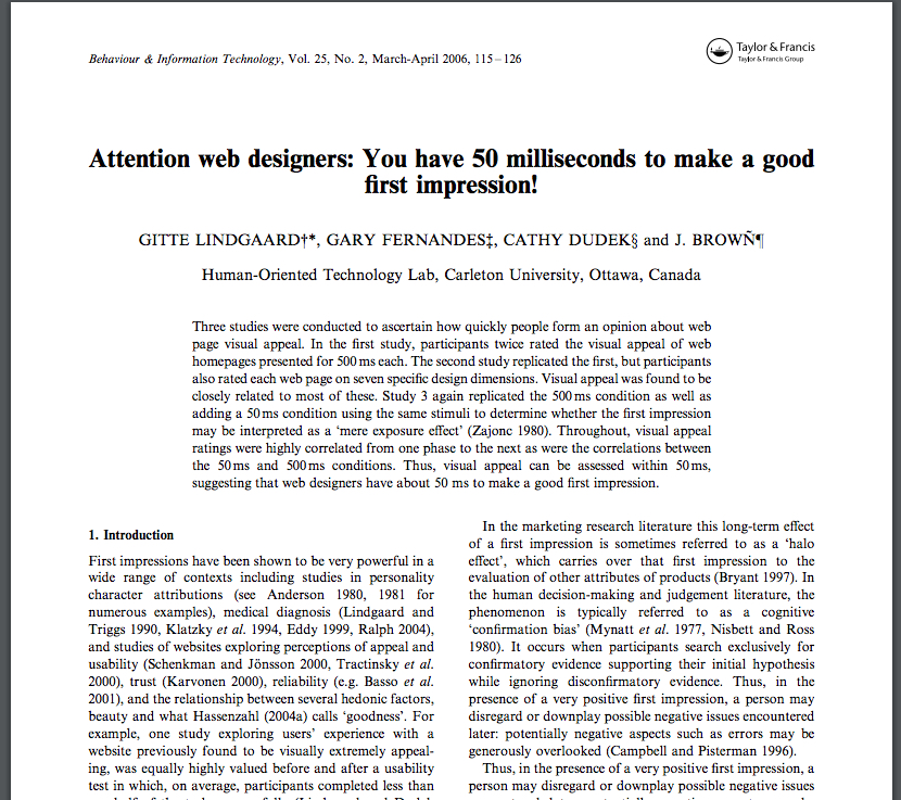
It takes five seconds or less for a user to decide whether or not they like your website.
Whether or not you realize it, you’ve proven the power of the five-second rule when you look at landing pages.
For example, let’s say you saw this ad in your SERP.
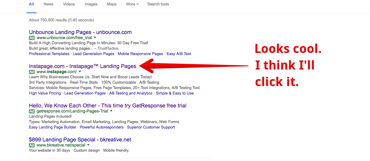
What happens next?
You see this page:
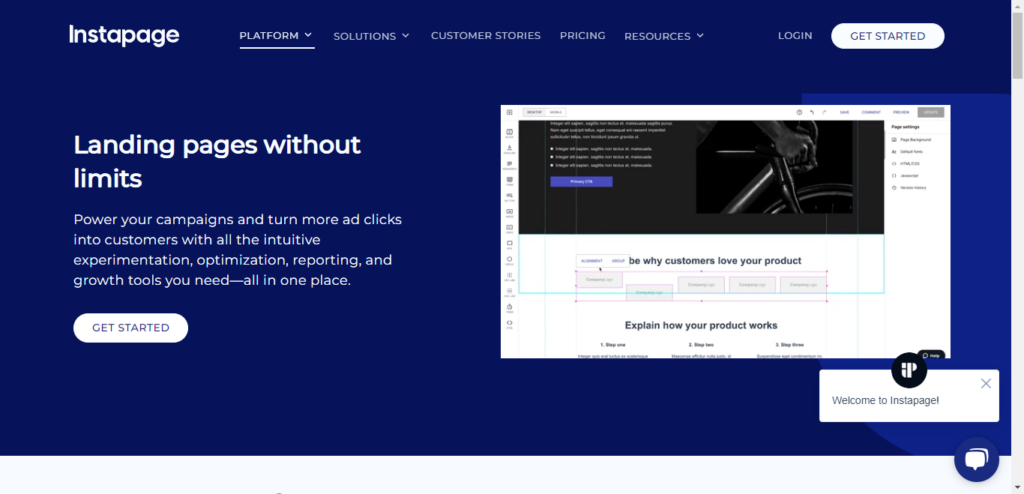
It took us 1.86 seconds to read the headline, subheadline, and CTA. (We timed it.)
Do we like it or not?
Remember that we’re being subtly influenced by the color of the website, the image behind the text, and the negative space surrounding the information.
In less than five seconds, we’ve decided whether or not we like this page and whether we will click on the CTA to get started now.
That’s the power of the five-second rule.
3. Make load time lightning fast
As mentioned in one of Quick Sprout’s posts, there is a 7% decrease in conversion rate for every second delay in page response.
This ties into the five-second rule: visitors should be able to get the gist of what you’re offering and understand the inherent benefits of it within five seconds.
If your landing page is cumbersome and slow to load, scale back your content, and do whatever it takes to speed it up.
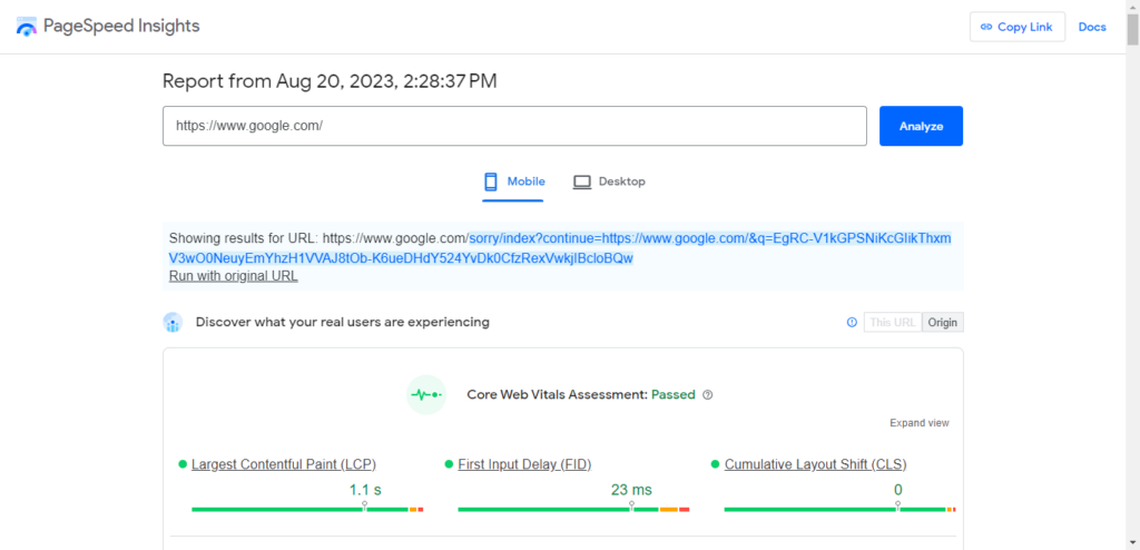
To test your website’s speed, use Google PageSpeed insights. All you need to do is plug in your website URL and get a quick score.
4. Ditch carousels and sliders
You could make the argument that these look cool from an aesthetic standpoint.
Maybe that’s why so many marketers think that it’s a good move to use carousels/sliders above the fold on a landing page.
But this can be a death blow to your conversion rates.
To prove this point, the University of Notre Dame tested a slider on its homepage and found that approximately 1% of visitors clicked on a feature:
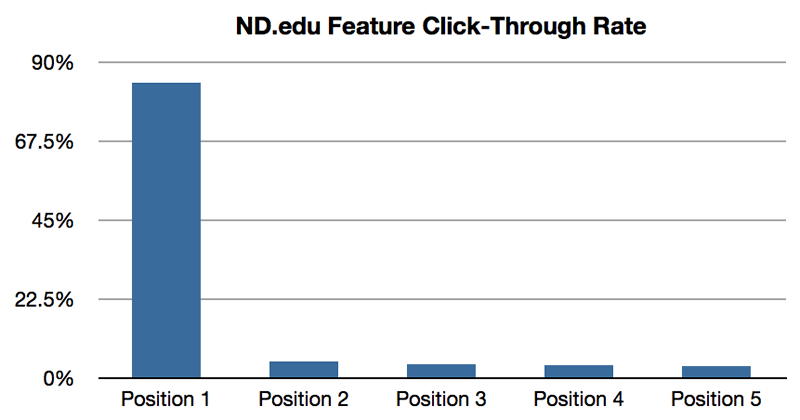
It’s not exactly ideal, is it?
When users see something, they will click on it. If that “something” keeps changing, the likelihood that they will click on it drops.
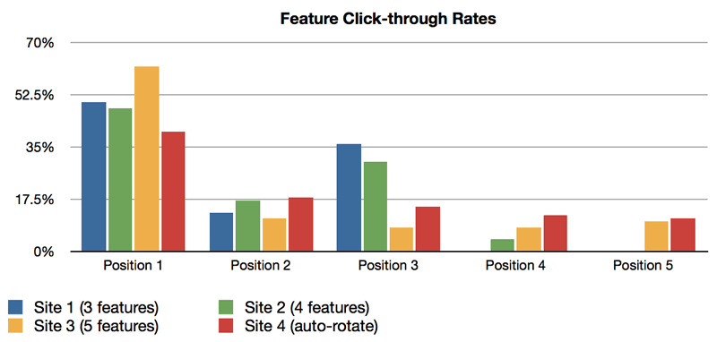
The bottom line here is that such elements only add to the “busyness” of a landing page and detract from its value.
Decide what your landing page should display—instead of a slider or carousel—and stick with that.
5. Use plenty of white space
Today’s average visitor is a skimmer and scanner.
They don’t want to get bogged down with lengthy paragraphs and bulky blocks of text.
In fact, “a study found that good use of white space between paragraphs and in the left and right margins increases comprehension by almost 20 percent. Readers find it easier to focus on and process generously spaced content.”
By following this principle, you can make it easier for visitors to navigate your landing page.
Notice how Buffer uses white space on its landing page:
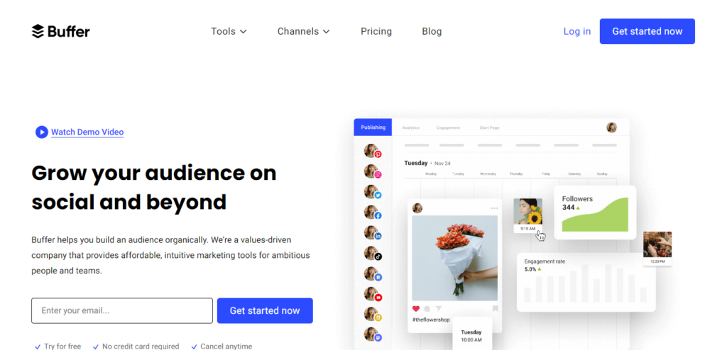
If we cram all that content together, it takes up little more than a tiny corner of the page.
Apple is famous for its use of white space. Its branding, product design, and even its store layout are founded on the importance of negative space/white space.
Its MacBook landing page shows the use of white space:
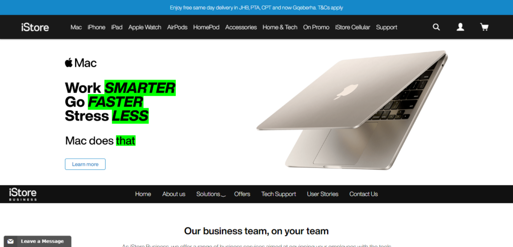
Take a page from Apple’s playbook, and consider using extra white space.
6. Use social proof for leverage
It’s pretty undeniable that humans are social creatures by nature, and we’re all influenced by others, at least to some extent.
Often, social proof is all it takes to convert someone on the fence.
For instance, you might include a list of some top companies who have used your product/service, along with their logos.
We’ve dubbed this term “logo porn.”
Crazy Egg displays some of the recognizable companies that have used the product.
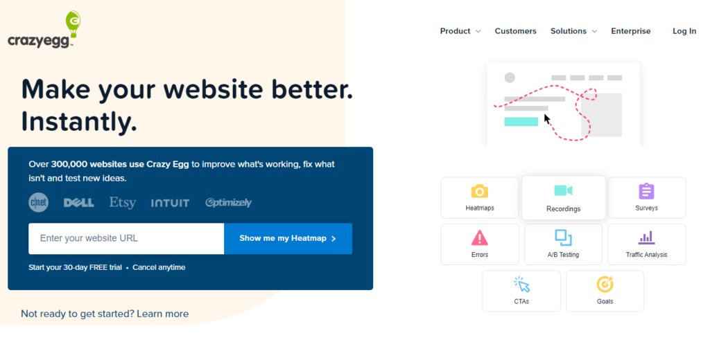
This doesn’t take up a lot of space, and visitors can quickly scan your landing page without much effort.
Leadpages uses the same approach on its landing page (which, ironically, is about landing pages):
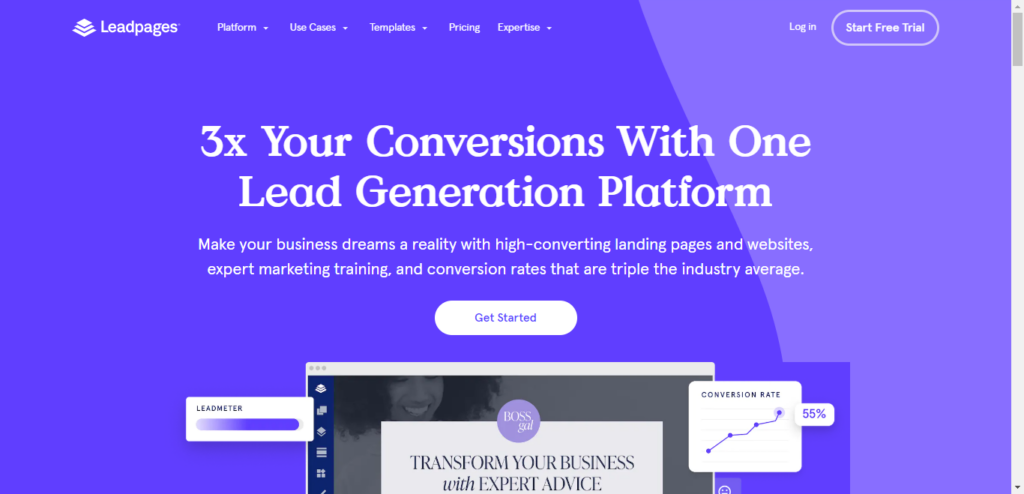
This can really boost your trustworthiness and reputation in your customers’ eyes.
7. Make contact info readily available
Putting yourself in the shoes of prospects is critical for increasing conversions.
For all they know, you’re some charlatan, snake oil salesman who’s just going to take their money and run.
To alleviate their fears, including your contact info is helpful so they can view it without clicking on anything.
Quip displays its contact information at the top of the landing page. If you’re so inclined, you can pick up your phone and call them.
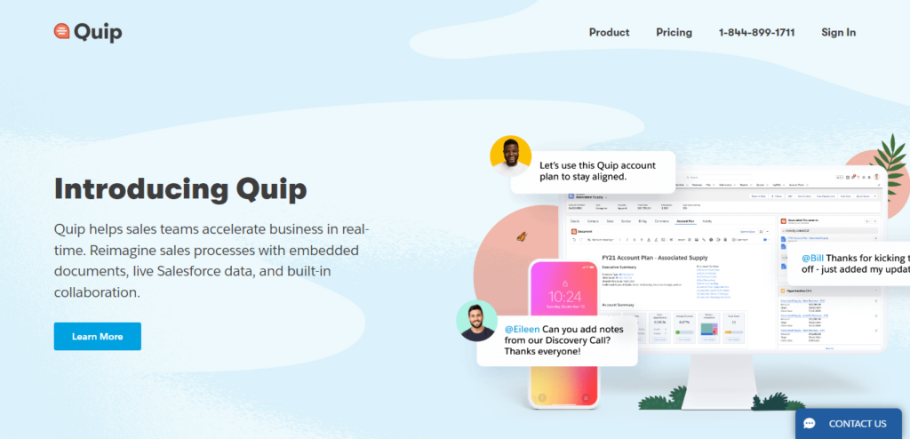
This piece of information lets your page visitors know you’re a legitimate business with an actual physical location, which should put their minds at ease.
8. Pepper in testimonials
Although this tactic might not seem exactly cutting-edge or game-changing, it can still help conversions.
Testimonials (especially with pictures) can really hammer home your product/service’s value.
Quip’s landing page provides a great example of how this works:
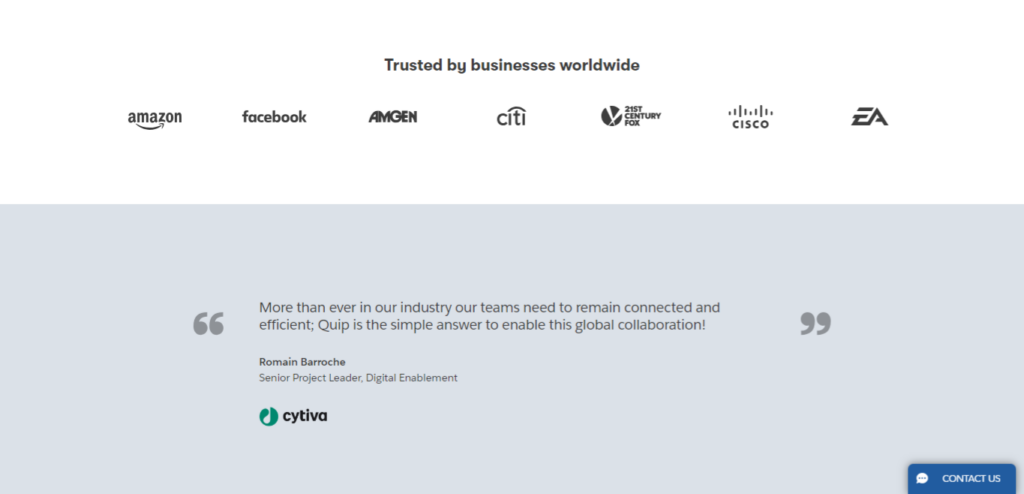
As HubSpot shows, testimonials that display a name, picture, position, and company logo are particularly powerful.
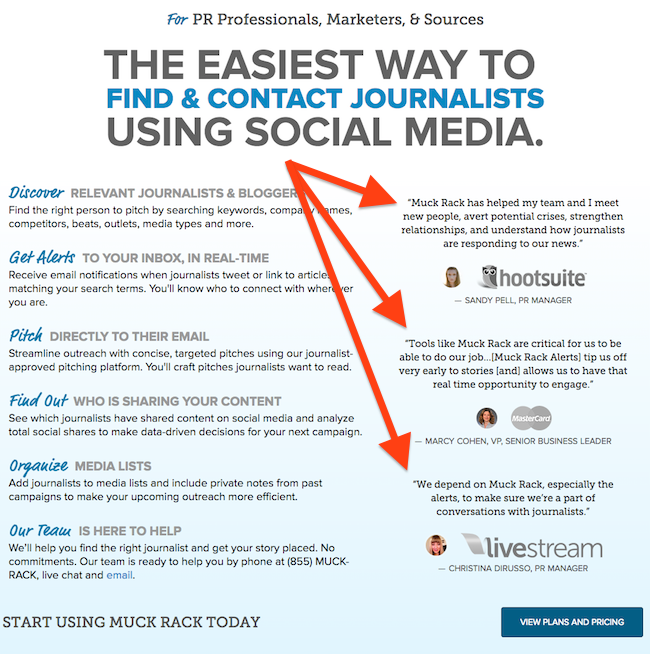
Sometimes, testimonials can come from well-known people. Other times, they could come from ordinary people, more aligned with your target customer.
Tweet Hunter displays some testimonials from both groups of people.
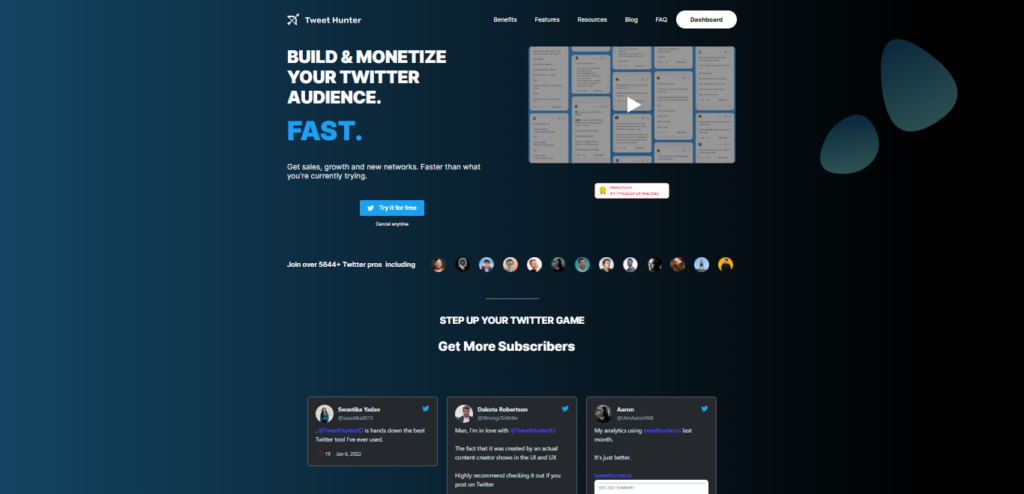
Testimonials like these can help a casual visitor start thinking about becoming an actual customer.
9. Add video
Did you know that using videos on landing pages can increase conversions by 86%?
That’s not a number to scoff at.
We realize this seems to be at odds with our recommendation of a minimalist layout, but it’s possible to keep it simple while incorporating video.
Take a look at ClickFunnels. Its landing page displays a video that starts playing automatically when you reach the page:
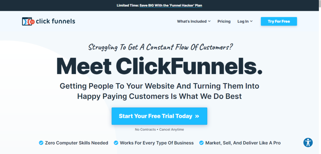
It’s quirky. It has real people. It has dialogue.
We’re hooked.
We’re more likely to convert after watching the video for a few minutes. Why?
Because we spent time watching the video. And because while watching that video, we realized the importance and usefulness of the product.
Just keep it brief (five minutes max), and use it to educate and entertain your visitors and create a personal connection.
10. Add social share buttons
While the debate over how much social shares impact SEO continues to rage, you can’t deny that having plenty of social shares on a landing page can positively impact conversions.
This is yet another way to use social proof to your advantage.
Conclusion
Even visitors who don’t intend to buy when they reach your landing page can be persuaded to take action if you use the techniques in this article.
Landing page optimization can be complicated. It can be confusing. It can take a lot of time to get in the minds of your customers and determine how to satisfy their needs
We would never recommend that you shortcut the research, the persona development, and all the hard work that goes into creating a compelling landing page.
However, sometimes you need a brief guide or a list of tactics like this one.
These ten methods will allow you to jump into any marketing situation, create effective landing pages, and convert those casual visitors into customers.
