Ever wonder what your website looks like on a smartphone? There’s a simple way to do it even if you don’t have your phone handy. Use your computer. It’s easy to do and we’ll show you how.
And if you want to see the desktop view of your website on your phone? We’ll walk you through that, too. We’ll even show you the options for different ways to view your site using website builder tools.
Use Desktop Browser View to See the Mobile Version of Your Site
Popular browsers like Google Chrome and Safari have many semi-secret features that most casual users don’t know about. One of those is the ability to view the mobile version of a website from your desktop computer.
Why should you care? According to analytics firm Statista, nearly 60 percent of website traffic comes from people using mobile devices—and this doesn’t even include those using tablets. Knowing this, you can’t afford to give your mobile visitors a subpar experience.
If you have or manage a website, especially one with an ecommerce component, you want to make sure your site is mobile-friendly. The easiest way to identify issues is to see how your site looks when viewed on a smartphone. The more responsive your site, the better the visitor experience.
Every popular browser lets you see your site through the “eyes” of a mobile phone. While the interfaces vary among browsers, all make it easy to do. Let’s take a look at how this works in two of the most popular browsers, Google Chrome and Safari.
View your mobile site on Google Chrome desktop browser
Step 1 – Open the Inspect Element tool
There are four ways to access the Inspect Element tool in Google Chrome.
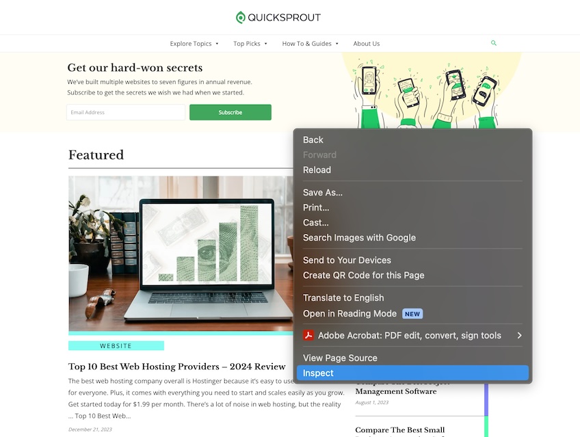
Option 1: Open Chrome, navigate to your site, then right-click anywhere on the page. In the drop-down menu that appears, select Inspect.
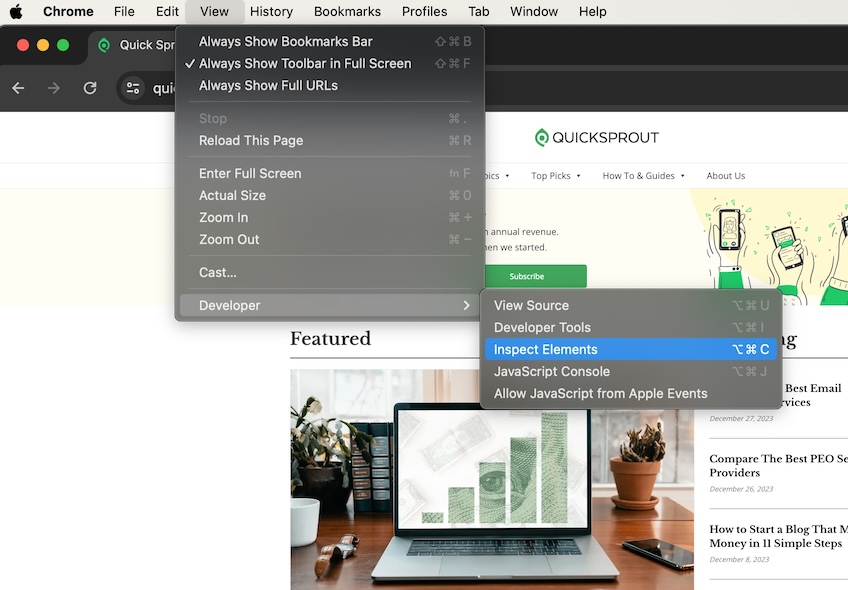
Option 2: In the top navigation menu, select View > Developer > Inspect Elements.
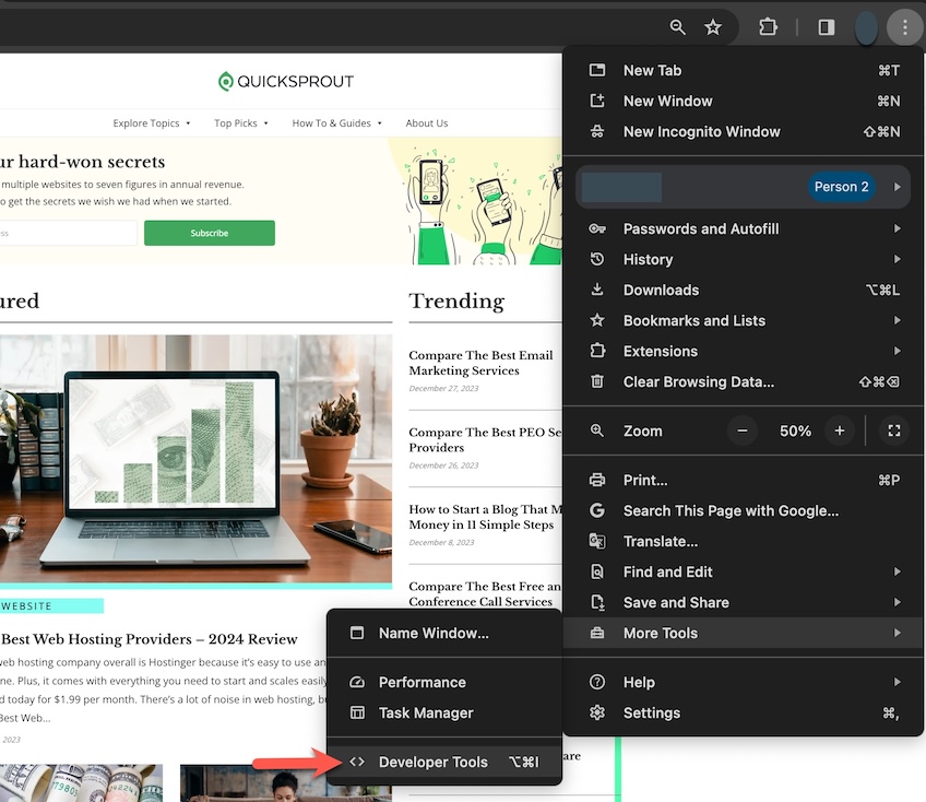
Option 3: Select the three-dot icon in the top right corner of the Chrome window, then choose More Tools > Developer Tools.
Option 4: Use a keyboard shortcut. On Windows, it is Control+Shift+C, and on Mac Command+Option+C.
Step 2 – Activate the Toggle Device Toolbar
Once you open the Inspect Element tool, the screen is then divided into two parts. One side will show your site and the other side is filled with code and technical data.
On the side of the screen with the code, navigate to the Toggle Device Toolbar icon in the upper left corner. It looks like a desktop monitor with a mobile phone icon in front of it. This is the icon you click to change the view of your site on the other side of the screen.
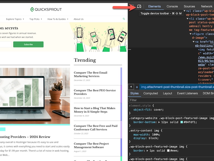
Click the icon to go back and forth between mobile and desktop view. The image on the left will change to reflect the current view.
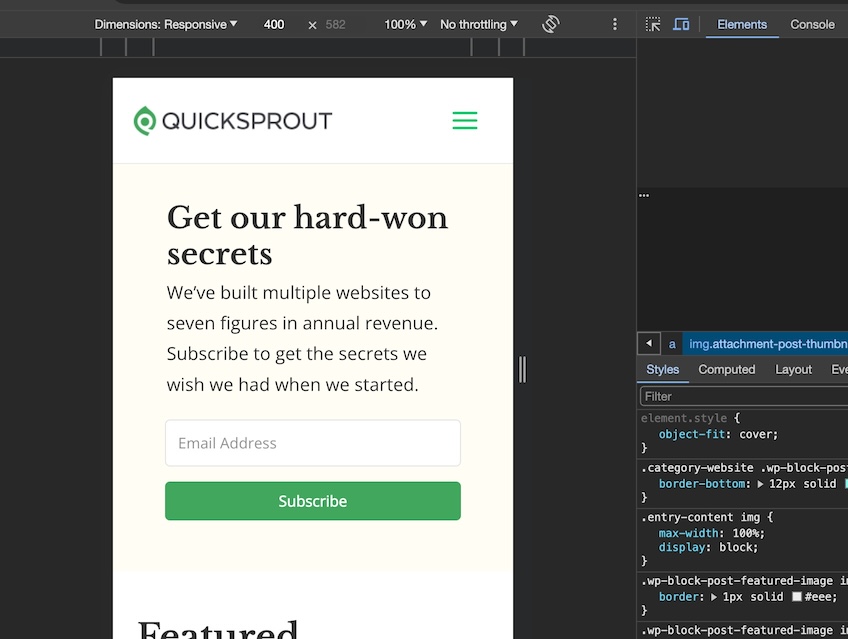
Here’s how the screen looks when you choose mobile view. You’ll also see a new set of icons above the mobile image. More on that in the next step.
Step 3 – Select device to preview
Now you can explore how your site looks in different mobile scenarios. You can choose preset options or customize your own.
When you select the Dimensions: Responsive dropdown menu, you can choose a device-specific option.
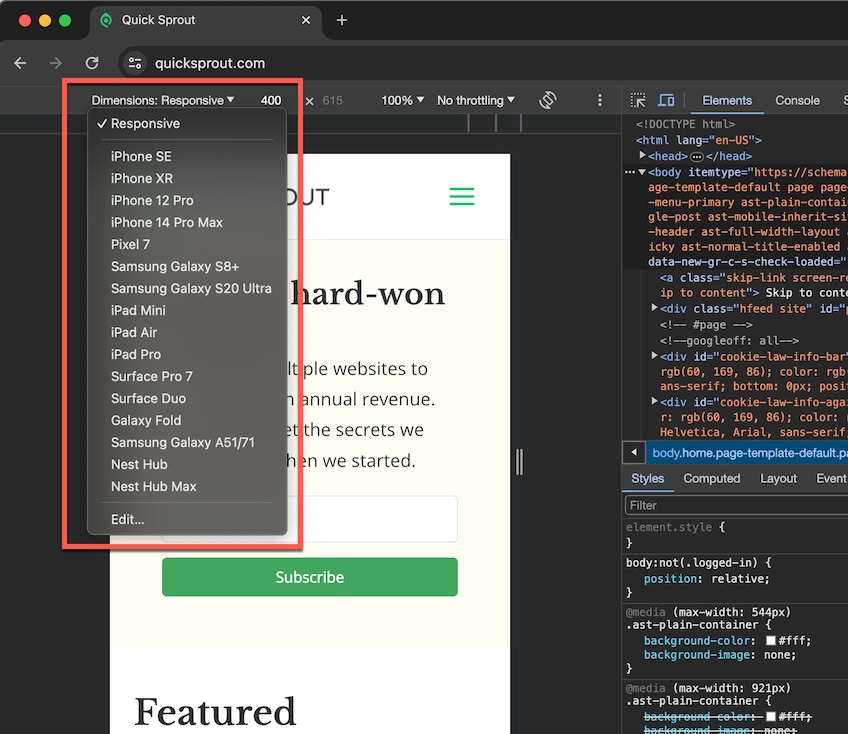
You can also edit this list to add or delete devices. This lets you fully customize the website views on mobile devices that matter most to you.
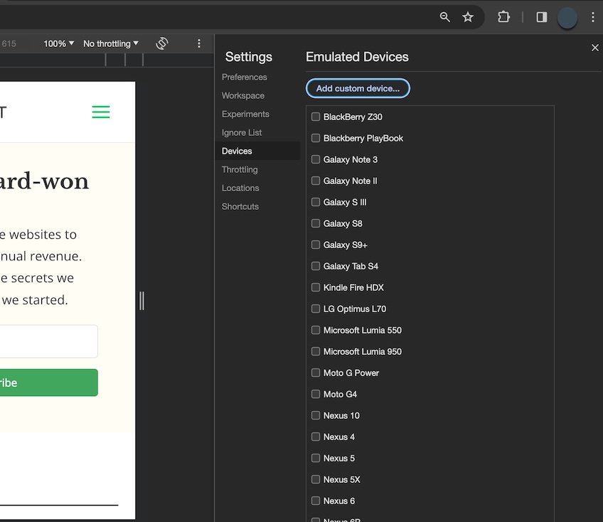
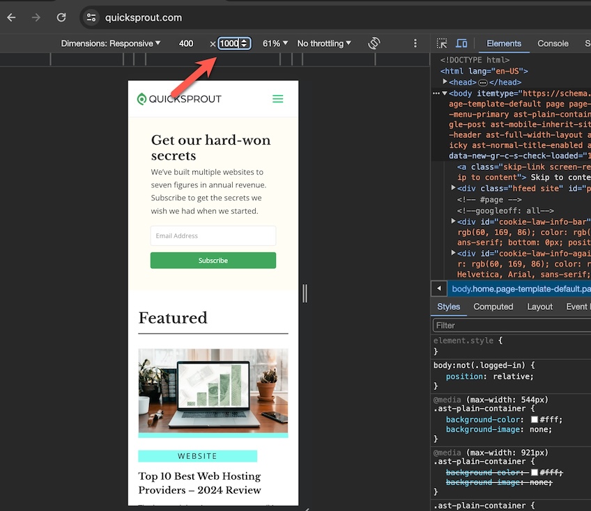
You can also fully customize the mobile size by manually changing the width and height dimensions.
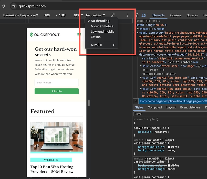
You can even test different internet speed scenarios with the Throttling dropdown menu. If you’re not familiar with bandwidth throttling, it is a tool some web hosting providers use to control shared server resources.
View your mobile site on Safari desktop browser
You must enable Safari’s developer tools for this to work. In MacOS Sonoma, do this by choosing Safari > Settings from the top navigation menu, then toggle the Show features for web developers checkbox options to ON. You’ll see Develop added to the top navigation menu.
Step 1 – Open Inspect Element tool in Safari
There are three ways to open the Inspect Element tool in Safari.
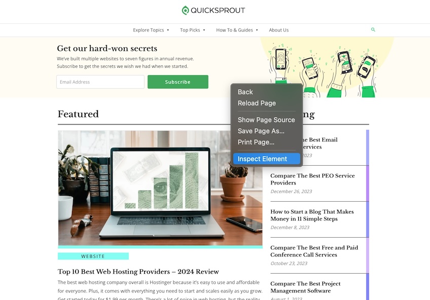
Option 1: Navigate to your site, then right-click anywhere on the page and select Inspect Element from the drop-down menu.
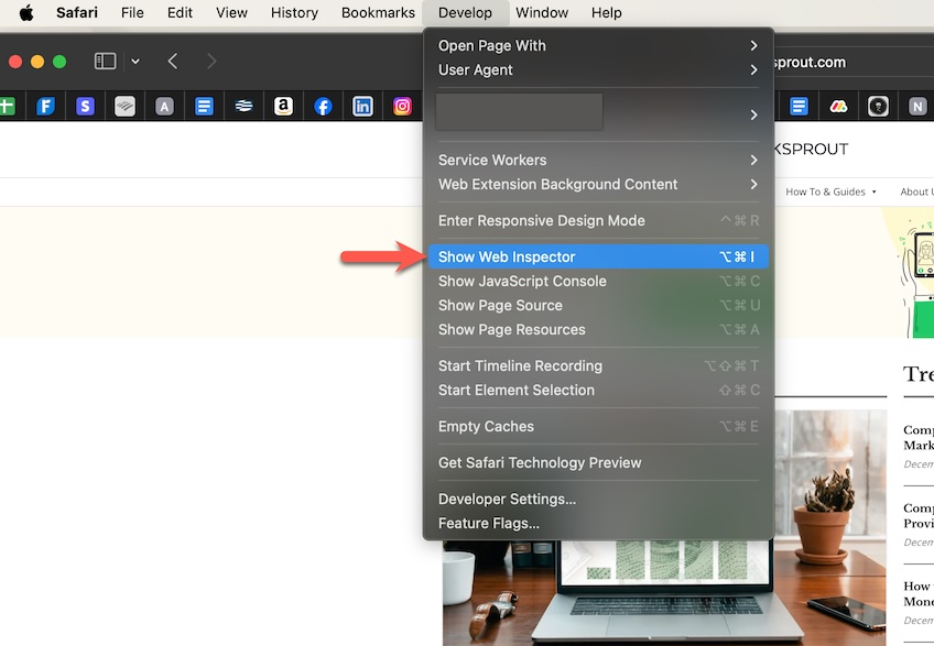
Option 2: From the top navigation menu, select Develop > Show Web Inspector.
Option 3: Use the keyboard shortcut Command + Option + I (capital letter ‘i”).
Step 2 – View device display options
Once you’re in Web Inspector mode, the Safari screen is divided in half. One side displays your site, and the other shows code and other developer-specific information.
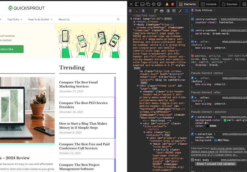
Don’t be alarmed. It may look intimidating, but unless you plan to tweak HTML or CSS code, you don’t need to go into Web Inspector mode at all. Safari gives you a direct menu option for viewing your site on mobile.
Jump straight into mobile view by choosing Develop > Enter Responsive Design Mode from the top navigation menu.
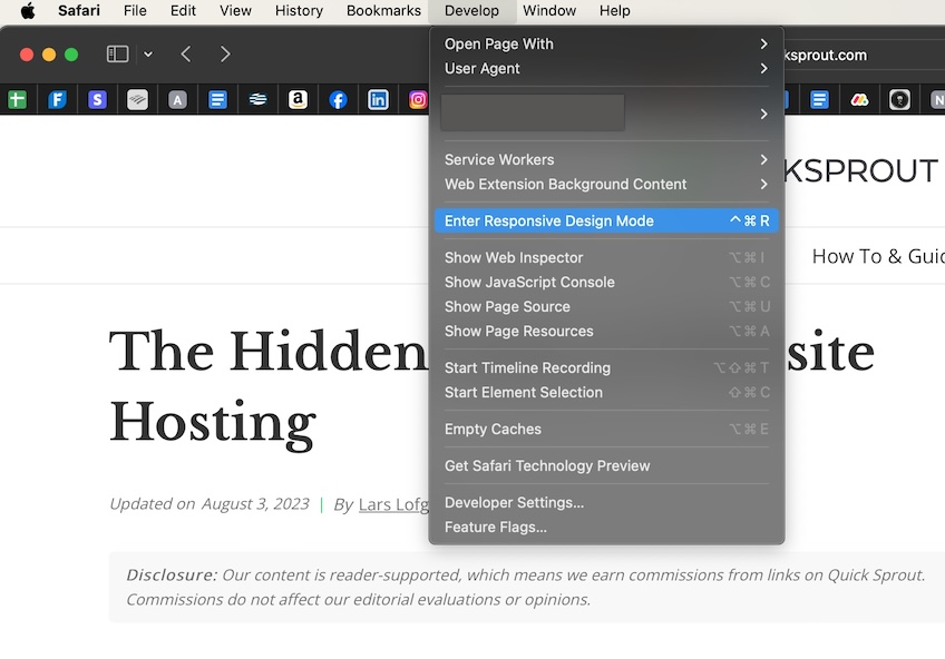
This is how the screen will look after you select Enter Responsive Design Mode without first opening Web Inspector.
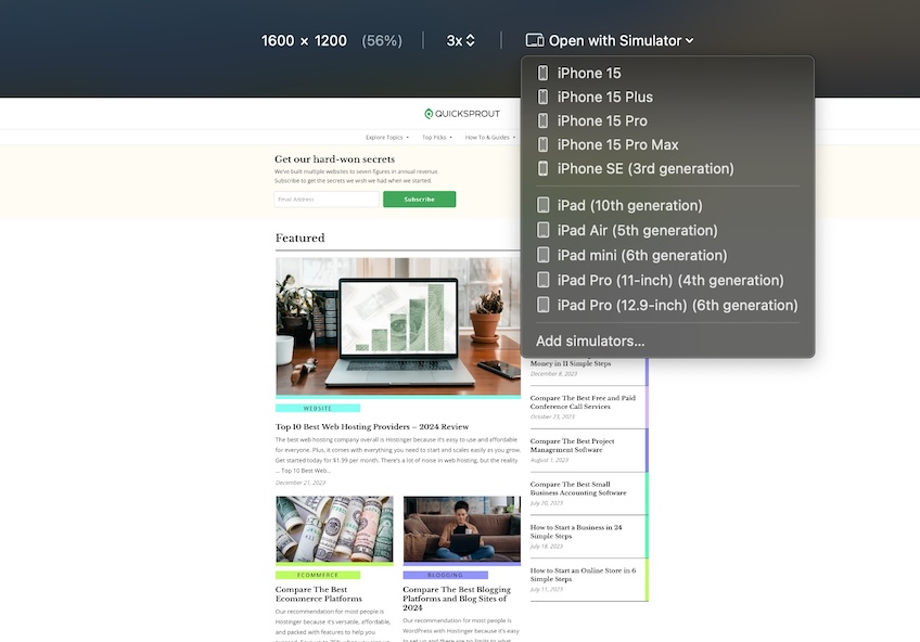
Here you can view your website in different iOS settings. Choose from predefined settings or customize as needed.
Enable Desktop View on Your Mobile Browser
More and more people use their smartphones to shop and conduct day-to-day activities. So it’s no surprise that website owners must keep the latest mobile trends in mind and optimize their site for mobile traffic.
In the quest to embrace mobile marketing strategies, though, you don’t want to lose sight of the visitor accessing your site the old-fashioned way—with their computer. You want your site optimized for both.
It’s easy to check how your website looks in desktop view even if you only have your mobile device handy. Whether you’re using an iPhone or Android device, here’s how to do it.
Access desktop view on iPhone
The process varies slightly depending on which browser you use on your iPhone. Here we’ll show you how to do it using two of the most popular—Safari and Google Chrome.
View Desktop Mode on Safari Mobile Browser
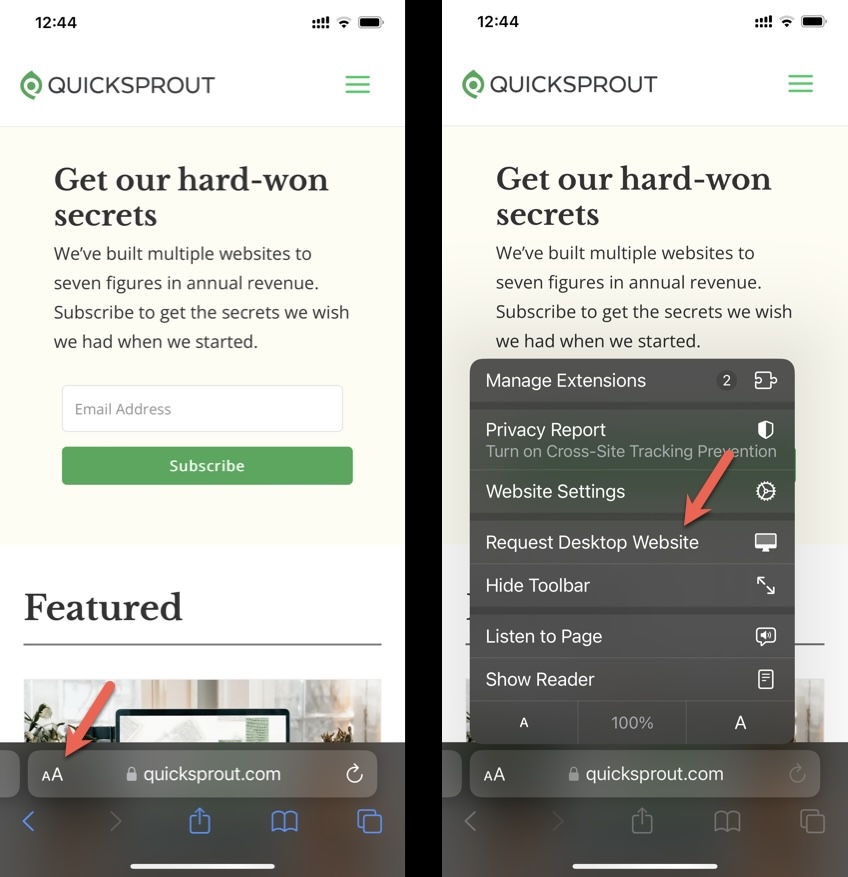
Open the Safari browser on your phone and navigate to your site. Select the Aa icon next to your site’s url. Then select Request Desktop Website from the popup menu. You will now see your site as it appears on a desktop browser.
Desktop Mode on Chrome
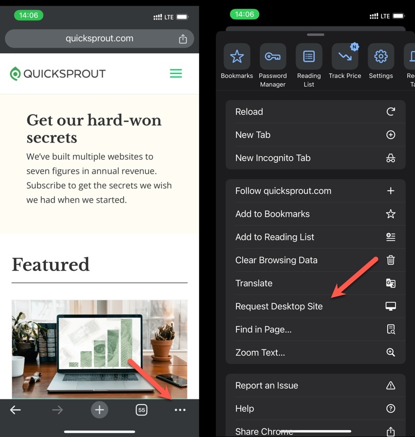
Open the Chrome browser on your iPhone and navigate to your site. Select the three dots icon in the lower right corner. Then select Request Desktop Site from the popup menu.
Access desktop view on Android
Switching to desktop mode in Google Chrome on your Android device is easy.
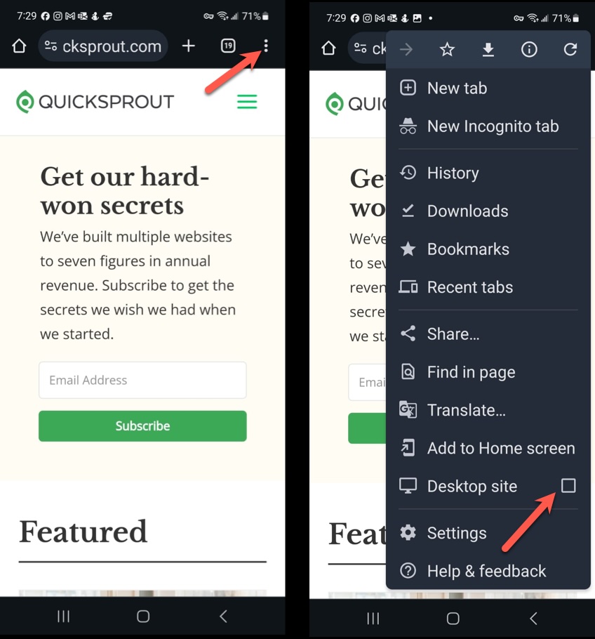
Open Chrome on your phone and navigate to your website. In the address bar, tap the three vertical dots (the Kebab menu), then check the box for Desktop site. That’s all there is to it.
Other Ways to View Your Website On Mobile
There is another handy way to check the responsiveness of your site. Whether you’re using WordPress, Wix, or any of the other top website builders out there, most have a feature to see your site in mobile, tablet, or desktop view.
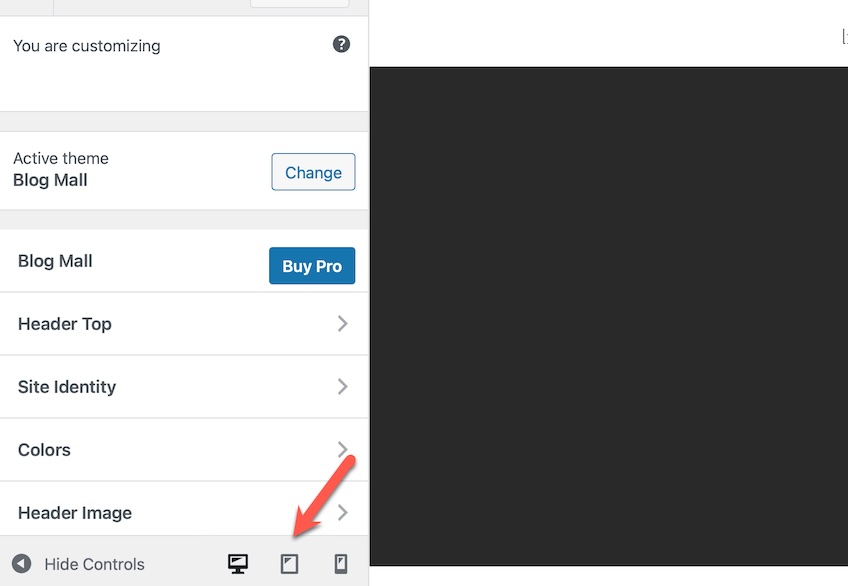
In WordPress, for example, you can change the view through the sidebar menu on your Admin Dashboard. On the sidebar menu, choose Advanced > Customize, then look for the icons at the bottom of the left side of the screen. You can toggle between desktop, tablet, and mobile view.
This is a convenient way to make tweaks in real-time to optimize the mobile experience for your visitors.
