Have you ever wondered how long your landing page should be? Some people say long landing pages convert better, while others say short ones are better.
So, the question that comes to mind is:
How long should your landing page be?
Sadly, the answer isn’t as simple as “long” or “short”. The real answer is “it just depends”. But don’t worry, we’re going to break down how you should determine if you need a long or short landing page.
What are your visitors’ objections?
Have you ever wondered what the biggest secret to a high converting landing page is? It all comes down to answering objections.
Good marketers don’t place text, or proof elements like testimonials, on a page for no reason. Everything you place on your landing page should address potential objections.
For example, if someone tells you they aren’t willing to make a purchase from your site because they don’t feel safe about putting in their credit card details, you would want to combat this through trust seals such as VeriSign or customer testimonials.
Before you answer your visitors’ objections, however, you need to find out what they are. By using surveying tools like Qualaroo, you can ask your visitors questions like:
- What else would you like to see on this page?
- Why didn’t you complete the purchase?
- What’s the one thing that I could have done to convince you to sign up?
People will share with you their reasons for not converting. Once you have 30 or 40 responses, you will start seeing commonalities.
You can then take those objections and integrate the answers to them within your landing page copy. Once you implement this, you’ll notice an increase in your conversion rate.
The one thing to note when answering objections is that you shouldn’t worry about your page length. Sometimes you will be able to answer them through a simple image. Other times, e.g., in the case of a more complicated objection, you will have to include a few paragraphs of text.
The bigger the ask, the longer the page
If you are asking someone for their email address in exchange for a free ebook, your landing page probably doesn’t need to be too long. Why? Because asking someone for an email address isn’t too big of a deal.
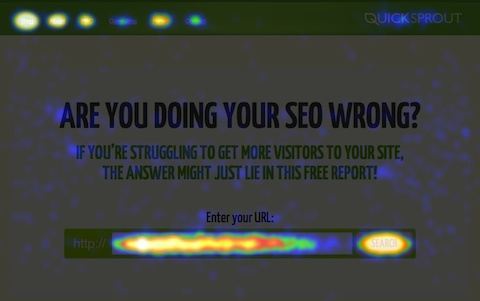
A good example of this is the Quick Sprout homepage.

In 2013 it converted at 67.2%, which isn’t bad. It’s still quite active. It does well because we are only asking you to enter your website URL. We’re not selling anything, nor are we even asking you for your email address. For that reason it’s easy for us to have a high conversion rate through a short landing page.
On the other hand, if you are asking someone to make a $1,000 purchase from your site, you will need a long landing page. No matter what you are selling, people are always nervous about big purchases even if your company is well known. By having a long landing page, you’ll be able to build a connection with your visitors, plus you’ll be able to answer all of their objections.
Break up your landing pages
Whether you are selling a product or a service, you should consider breaking up your landing page into multiple steps. This will train your visitors to make small commitments, which makes them more likely to complete the transaction.

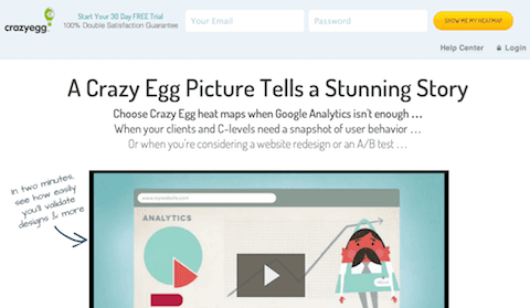
For example, we ask for an email and password on Crazy Egg before we ask for your credit card information. In other words, we’ve broken this down into two steps instead of one. Why? Because through A/B testing, we’ve learned that you are at least 10% more likely to complete the purchase in the two-step scenario. Apparently, you feel that since you have already given us your email address, you might as well give us your credit card details.
This is what we call the hoop theory, which says that getting your visitors to invest a little at a time will turn them into customers.
This strategy is so effective that e-commerce companies use it with their checkout process. Just think about Amazon…When you are checking out, you see your cart first, then a landing page with your shipping information and then a credit card checkout page.
To show you the effectiveness of breaking up your landing page into multiple steps, we decided to run a test on Quick Sprout. We added an email address field to the homepage, and it dropped the conversion rate down to 29%: out of 100 visitors, only 29 gave us their URLs and email addresses.
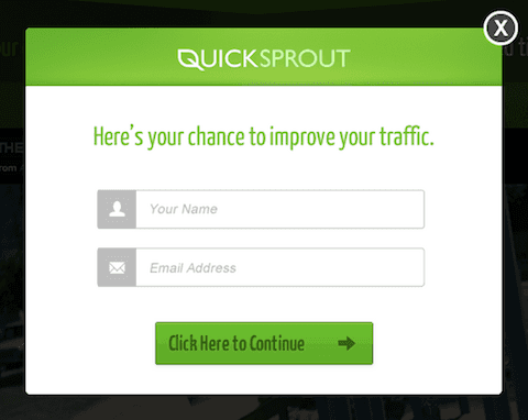
But when we asked visitors for their email addresses in step 2, instead of the homepage, there was a 91% chance that they gave them to us.

That means out of 100 visitors, 67 entered their URLs. And out of the 67 people that entered their URLs, 60 gave us their email addresses.
By breaking up the landing page into two steps instead of one, we were able to collect 60 emails instead of 29. That’s a big difference.
Avoid these common mistakes
When creating a landing page, you’ll notice that silly little mistakes will affect the length and, more importantly, your conversion rate.
Your goal shouldn’t be to create a short or long landing page; instead, it should be to create a high converting page. Here are some of the things you need to keep in mind:
- Simplicity is the ultimate sophistication – do not sell more than one thing on your landing page. The more complicated you make things, the lower your conversion rate will be. You can also keep things simple by reducing options such as navigational ones.
- A picture says a thousand words – when possible, use images or videos to describe your product or service. This will help you reduce the length of your landing page.
- Don’t forget the fold – people have an attention span of 8 seconds, so make sure you grab their attention above the fold.
- Messaging is important – when you surveyed your visitors to figure out their objections, they told you what they wanted to see. If you use the commonly mentioned words within the survey results in your landing page copy, you’ll see an increase in conversion rate.
Conclusion
If you are making your visitors commit to a small ask, e.g., give you their email address, and they don’t have too many objections, your landing page should be short.
If you are asking for a big commitment, e.g, making a $1,000 purchase, you’ll need a long landing page as there will be a lot of objections for you to address.
The length of your landing page typically revolves around how big or small your ask for a commitment is as well as how many objections there are to it.
Once you create your landing page, make sure you run a few A/B tests as there are always exceptions to the rule, and there will be room to improve your conversion rate.
So, what do you prefer… long or short landing pages?
