We undertook a case study nine years ago to determine whether infographics impacted traffic.
Today, we’ll look back at that study to see whether the opinion of the tester aligns with the current position of infographic marketing.
Before the data exercise in 2014, we used to be big fans of leveraging infographics to grow our traffic and brand. Why? Because it used to provide exceptional results.
The results were so great that when we started releasing infographics on the KISSmetrics blog in 2010, it helped us generate 2,512,596 visitors and 41,142 backlinks.
Based on the KISSmetrics stats from 2010, we know infographics worked well then. But the real question is: do they still work today?
Over the years, we’ve created hundreds of infographics, so let’s analyze the data to see what we can glean from these numbers:
The KISSmetrics blog
Within the two-year period from 2010 to 2012, 47 infographics generated 2,512,596 visitors and 41,142 backlinks from 3,741 unique domains. They also generated 41,359 tweets and 20,859 likes.
That means, on average, each infographic generated 53,459 visitors and 875 backlinks from 79 unique domains. When it comes to social shares, each one generated 879 tweets and 443 likes.
After 2012, infographics weren’t providing the same results as before. One of the main reasons for the poorer ROI was their rise in popularity. More and more companies started leveraging them, which made them more common.
The newer infographics, on average, drove 21,582 visitors and 371 backlinks from 34 unique domains. As for social shares, each one generated 486 tweets and 259 likes.
The reason for the drop in traffic and links isn’t related to the quality of the infographics. We often used the same research methods to develop topics and the same designer. And we promoted them through the same channels.
As you can see from the KISSmetrics data, infographics still drive traffic but not as much as they used to.
Quicksprout
In addition to KISSmetrics infographics, we published infographics on Quicksprout every Friday.
Our goal with releasing infographics on Quicksprout is to help you understand complex marketing data through simple visuals. And our hope was that infographics would help generate a lot of traffic.
Because we didn’t get on the infographic bandwagon early enough on Quicksprout, we didn’t have the same results as we did at KISSmetrics. However, each infographic generated 41,487 visitors and 469 backlinks from 38 unique domains. As for social shares, each graphic generated roughly 621 tweets and 572 likes.
But what is interesting is that the infographics haven’t helped increase the overall search traffic for Quicksprout. You would think that the more backlinks you generate, the more search traffic you’ll have, but this hasn’t been the case so far.
We’ve also tested releasing infographics on Quicksprout on days other than Friday, but it didn’t make a huge difference in traffic. We would receive about 8% more traffic if we posted them on Mondays. We would get 11% more traffic if we posted them on Wednesdays.
Although the infographic stats look good on Quicksprout, they don’t seem to be doing as well when you compare them to our text-based posts. On average, our non-infographic blog posts generate 35% more traffic and 22% more search traffic.
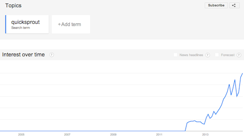
One other thing is worth mentioning. we have been receiving emails from people saying they see mentions of Quicksprout more often than before. Quicksprout’s logo, featured on each infographic, is primarily responsible for this effect. When others embed our infographics within their websites, they also promote the Quicksprout brand.

According to the graph above, this has helped increase Quicksprout’s popularity according to Google Trends.
Current role of infographics marketing
After reviewing our 2014 case study, there were some positives to consider.
However, the results didn’t indicate much in the way of increased traffic. In short — expectations and results didn’t align.
Nearly a decade later, it’s interesting to see the current state of play for content marketers and infographics.
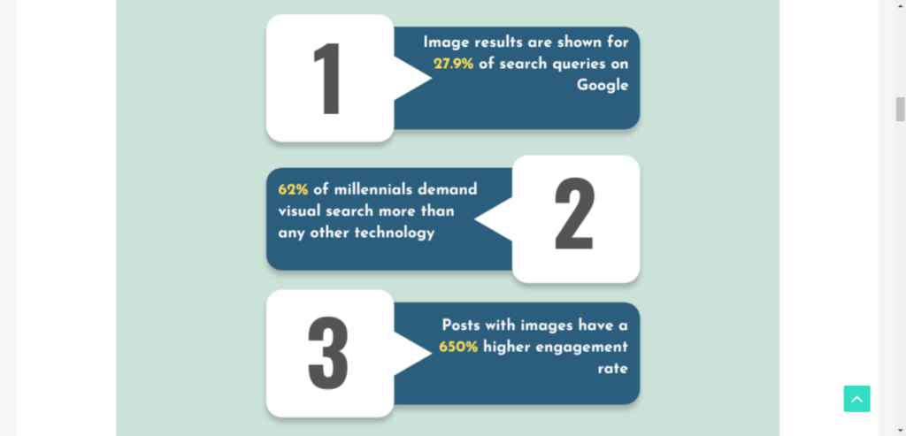
Demand Sage has curated some fantastic stats for infographics — these ones stood out most for us:
- Image results are shown for 27.9% of search queries on Google.
- 81% of readers skim blogs.
- Websites using infographics are witnessing a 12% higher traffic growth than the rest.
Infographics are the ideal visual solution for users who skim articles.
Condensing stats into a visually pleasing image without reading an entire blog is possible.
Here’s a final tip for anyone who’s considering using infographics in their marketing:
Canvas your clients/followers to extract original information. You can then use Canva to produce a unique infographic.
Your infographic may end up in numerous articles, generating more inbound traffic.
Conclusion
If you want to increase your search traffic drastically, infographics won’t help you as much as you think. Infographic links were more effective four years ago, but since then, Google has been tightening its algorithm, which tempers infographics’ impact on SEO today.
Although the data doesn’t look as appealing as it used to, if we were you, we would still continue to leverage infographics for the following three reasons:
- They still produce good traffic – Unless you are an exceptionally good writer, you will probably generate more traffic from infographics than your blog posts.
- It helps with branding – More people will see your brand, assuming you put your logo on your infographics. This will help increase the amount of direct traffic you receive.
- You’ll get great referral traffic – If it weren’t for infographics, we would have never generated links from sites like the Huffington Post. These links may not help boost your rankings as much as they did in the past, but they still drive qualified traffic to your site.
