It’s no secret we’re living in a mobile world. We’re hoping that by now, most of you have recognized this and adapted accordingly.
While having a mobile-friendly website is a great start, it’s not enough to drive traffic to your site. You also need to make sure your mobile website is optimized for Google searches.
More than 75% of people don’t look beyond the first page of a Google search. If your mobile site isn’t in the top few spots, people will find alternative pages to click.
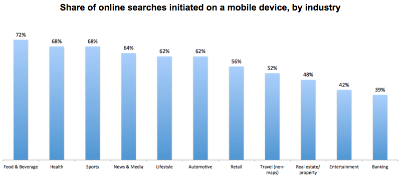
Roughly 60% of searches come from mobile devices.

As you can see from the data, the results vary by industry. But overall, Google searches from smartphones and tablets have surpassed searches from computers.
According to research from Statista, about 52.2% of all global web traffic comes from mobile devices. This number has been growing each year for the past decade.
We’re not seeing any signs of these mobile trends slowing down. In fact, we can expect to see the opposite.
Mobile search popularity will continue to grow. That’s why your website needs to stay ahead of the game. If you want to be successful, you must optimize your mobile site for Google searches.
If you don’t know where to begin, we’re here to help.
As experts in this space, we’ll share with you what you can start doing immediately to improve your mobile search ranking. Here’s what you need to know.
Focus on speed
You should be familiar with this idea. That’s because speed is a factor that improves your search engine optimization for desktop sites as well.
But pages load differently on mobile devices. Just because your website is fast on a desktop or laptop doesn’t mean the speed will translate to phones and tablets.
Websites that load fast generate more leads for businesses. Furthermore, faster mobile sites get ranked higher according to Google’s algorithm.
Did you know the top link on Google has a 28.5% chance of getting clicked?
You won’t get the opportunity to be the top search result if your page is slow. There is a direct correlation between page loading speed and conversion rates.
Getting your mobile site to load just one second faster can increase conversions by up to 20%.
What’s even more interesting is that the slower your mobile pages load, the higher your bounce rate will be. Mobile websites loading in 2 seconds have a 9% bounce rate.
You may not think 2 seconds is slow, but clearly people visiting your website do.
High bounce rates will adversely affect your Google search ranking from mobile devices.
How can you speed up your mobile site? Try to use minify code. Minify helps compress any code from its original size to the smallest size possible, without altering the code’s operations.
Basically, it makes modifications by removing unneeded characters from your code such as white space and new lines. This can reduce the size of your code by up to 95%.
In addition to compressing your code, you can also decrease HTTP requests, lower your server response time, use a CDN, and use RFPL caching to speed up your mobile site.
Use accelerated mobile pages (AMP)
As of 2016, Google officially integrated accelerated mobile pages into its mobile search algorithm.
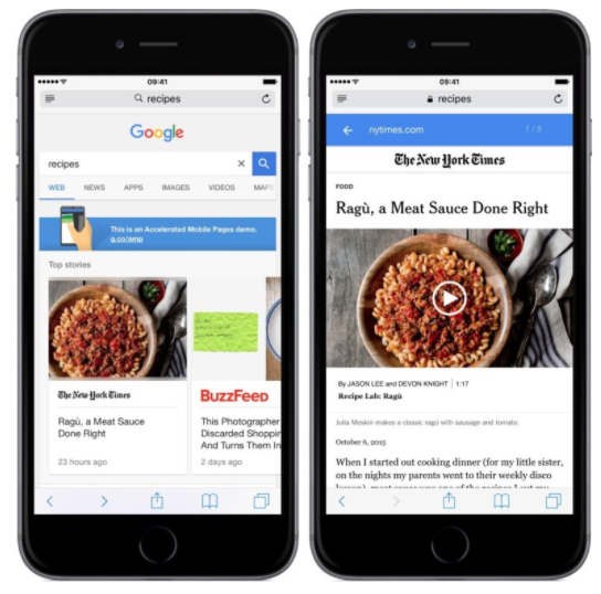
Here’s an example of what an AMP search result looks like from The New York Times:

When someone searches on Google, the AMP links appear at the top. When a page gets clicked, it loads nearly instantaneously.
Here’s how it works. Rather than hosting these pages on their own servers, Google uses a cached display of the mobile website from the original publisher.
That’s why it loads so fast without redirecting to the actual website.
Take a look again at the screenshot above of the AMP article from The New York Times. Notice that the top search bar is still a Google link as opposed to a link to The New York Times website.
There are three major components to building AMP pages:
- AMP HTML
- AMP JS
- AMP Cache
The AMP HTML is completely redesigned. This code uses custom commands to create dynamic content specifically intended for mobile devices.
Implementing AMP HTML makes it easy for you to code common patterns.
The AMP JS guarantees that all of your AMP HTML pages get rendered as fast as possible. You can manage all your resource loading with the AMP JS library.
Since all these external resources are asynchronous, nothing on the page can be prevented from rendering.
The Google AMP Cache automatically improves the performance of your AMP site. That’s because it fetches and caches all AMP HTML sites using a proxy-based delivery network for your content.
Select a responsive web design
Responsive web designs are also part of Google’s mobile search algorithm. Sites with a responsive design will get priority rankings.
The idea of a responsive web design is quite simple. You’ve got to code your HTML to adapt to various screen sizes as well as orientations.
In other words, your mobile pages need to respond well and look the same whether someone is using a 4-inch iPhone SE in a portrait orientation or a 10-inch Samsung tablet in a landscape orientation.
You need to take all different devices into consideration when you’re implementing a responsive web design:
We know right now we’re focusing on mobile devices. But that doesn’t mean you should ignore the fact that people are also using video game consoles, smart TVs, and even smart watches to search the Internet.
Compress images without compromising the quality
Earlier we explained you should compress your code to speed up your page loading time. You should apply the same concept to your images.
If you’ve been reading our blog for a while now, you know we like to use lots of images within our content. We’re not saying you should eliminate images completely from your mobile site.
But you need to compress the big files. Your best bet is PNG files. You can compress PNG photos up to 95% in Photoshop without compromising the quality of your pictures.
Doing this will take you some time. But it’s worth it in the long run.
Get rid of flash
While fancy animations and designs with flash may seem like a good idea in theory, they don’t help you with your mobile search optimization.
Websites with simple designs have higher conversion rates. Don’t believe us? Look at some of the mobile pages for the most popular companies you can think of.
They don’t have flashing lights or fancy bells and whistles to draw attention.
Plus, flash slows things down tremendously. We already discussed how important the speed is.
All of these elements help improve your business and make you more money. But they also improve your Google search ranking from mobile devices.
You’re better off eliminating flash completely from your mobile pages. Save it for when you’re designing a mobile gaming app instead.
Analyze the layout of your mobile site
So far we’ve been pretty technical. But sometimes you need to take a step back and look at the design of your mobile website.
Just for a minute, forget about your code, speed, or anything else that might confuse you. Check out things like the font size and points of emphasis on the page.
What draws your attention?
If you’ve used platforms such as Crazy Egg to analyze heat maps of the way website visitors browse on your desktop website, you can’t expect those results to be the same on your mobile pages.
You also need to take into consideration some other things.
Understand that people aren’t using a mouse to navigate. They’re using their fingers. Make sure all your buttons are far enough from each other and large enough to tap with a finger. Otherwise, the user experience will suffer.
If people have problems on your mobile site, it’s going to impact how frequently they use it, which can translate to poor search rankings.
Your mobile site needs to have a smooth navigation.
Use free tools to make sure your site is mobile friendly
At the end of the day, you’ve got to make sure your website has a mobile-friendly design.
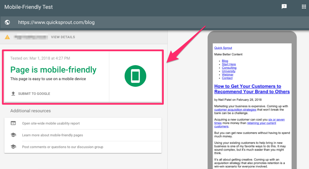
If you’re trying to improve your mobile search ranking for Google, the most obvious tool to use is the Mobile-Friendly Test from the Google Search Console.
Here’s what the results looked like when we tested Quick Sprout through their program:

It’s simple and straightforward. Our results showed Quick Sprout is easy to use on mobile devices.
If your website doesn’t do well on the test, use Google’s tools to fix the problem.
For those of you who are confused or don’t understand what these reports mean, you can always submit questions to forums or contact live customer support.
You can also check to see a more detailed description of where your mobile search traffic is coming from.
That way, you can segment your data and ultimately improve the customer experience while optimizing your mobile search results at the same time.
Recognize how people search from mobile devices
People don’t use their mobile devices the same way they use their computers.
Think about your own search behavior, and you’ll see what we’re talking about. When you’re sitting a computer, you’ve got plenty of time. You have two hands on the keyboard and can type long search phrases with ease.
But when you’re browsing on a mobile device, you’re on the go. Maybe you’re standing at an intersection, waiting to cross the street. Or maybe you’re in line at a coffee shop.
This means people are in a rush and more likely to make mistakes when conducting their searches.
You need to tag your content based on how people search from their mobile devices.
We’re not saying you need to purposely add typing mistakes or improper grammar. But you can still find clever ways to add shortened keywords to your mobile site.
Google has a 90 character title limit for mobile devices. For desktops, it’s 160. You can add more characters to your mobile titles to try to get more exact search matches from mobile users.
Eliminate pop-ups
As of January 10, 2017, Google released an update to its mobile algorithm that penalizes sites for not making content easily accessible during transitions from mobile search results.
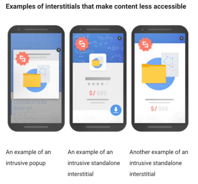
Basically, your ranking will be negatively impacted if you have pop-ups hindering the user experience.
Here are some examples of pop-ups that Google considers to be intrusive:

Having pop-ups won’t make or break your success on Google’s search results. There are plenty of other elements that get factored into this algorithm as well.
However, when Google tells you it’s making specific changes to its algorithm, you’d be wise to follow its advice.
Get rid of your pop-ups.
Conclusion
People use their mobile devices to search the Internet.
To ensure you have the best chance of reaching a wide audience, your website needs to be optimized for mobile searches.
Make sure your mobile pages load fast. Compress your code, eliminate flash, and reduce the file sizes of your images and get rid of pop-ups.
Create an accelerated mobile page that has a responsive web design. Understand that people don’t search the same way on mobile devices as they do on their computers.
Additionally, review the layout of your website, and use free tools to test whether your website is mobile-friendly.
If you follow these tips, you’ll get ranked higher on Google search results from mobile devices.
