In short, website carousels are generally not a good idea—just like opening an article with 10-year-old statistics (but we’re doing it anyway).
A 2013 study from Notre Dame University showed that only 1% of visitors clicked on static website carousels, and only 8% of visitors clicked on auto-rotating carousels. That’s pretty weak.
If done right, however, website carousels (and 10-year-old research) can still be useful in some cases, such as displaying large amounts of information without cluttering the user experience.
This is a deep dive into website carousels—we’ll be detailing what they are, their different types, and the pros and cons of each. We’ll also share a few tips on what makes a carousel really good.
What is a Website Carousel?
Think of website carousels as miniature slideshows on your web pages. They allow you to display dynamically shifting content within a single design element, such as changing blocks of text, images, or videos.
Each piece of content appears as its own slide, typically moving on a horizontal or vertical axis to make room for the content that comes before and after it.
Website carousels include the following elements:
- Slides—The content pieces that make up the carousel.
- Container—The web page area where slides are placed.
- Buttons—Dots, arrows, or other symbols that allow users to move between slides.
- Transitions—Animated effects that signal movement from one slide to another.
Apart from displaying numerous content pieces without taking up a lot of screen space, website carousels can also improve the aesthetics of a web page by giving it a sleek, modern look.
As such, carousels are common among content-heavy websites like online stores and portfolio websites. Given their dynamic nature, carousels can also make web pages feel less bland and encourage users to interact with it more than they would on pages that don’t move at all.
Website carousels can take up many forms, and they can move in many ways, including:
- Hero image carousels
- Full-screen or full-page carousels
- Product sliders
Hero image carousels
A hero image is the first large visual element (image, graphic, or video) that a visitor sees on a webpage. As the name implies, this type of carousel is placed in the hero image section of the page, so it’s the immediate focus of any website.
This approach is ideal for online stores that want to put the spotlight on multiple products or promotions simultaneously—it offers plenty of space to include large, high-quality product images above the fold without cluttering the page or forcing users to scroll.
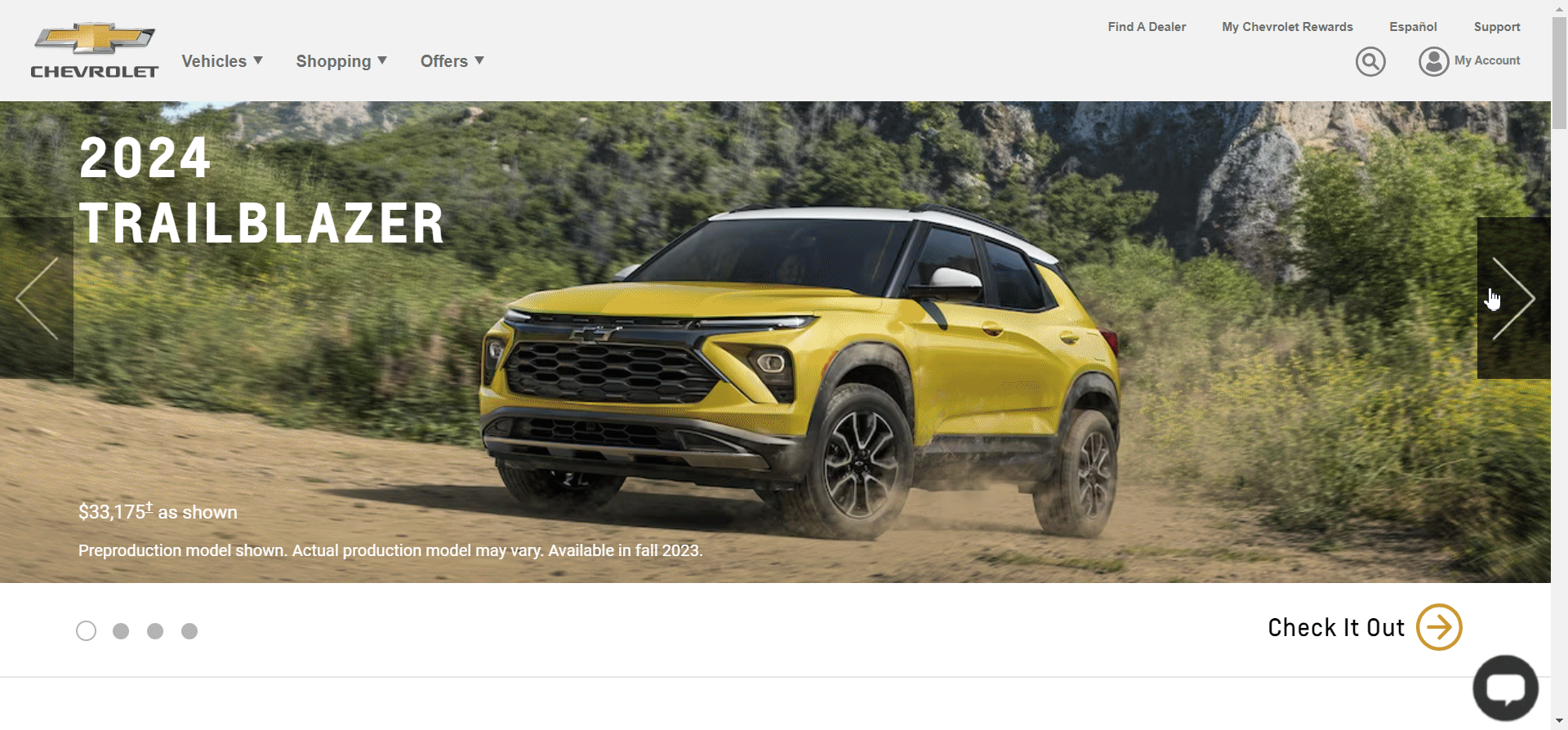
Chevrolet’s website is an excellent example. Notice how the navigation arrows are prominent and unmissable. This quickly communicates to visitors that they can browse through multiple slides. Moreover, the dots in the bottom left also indicate how many total slides the carousel contains.
The slides are well-designed and differentiate the product images from the text. The copy is minimal yet descriptive, and uses a white-on-black color scheme to stand out. The prices are highlighted in bright colors and use large fonts to attract attention.
Lastly, each slide includes a CTA in the bottom right. Notice how the CTA copy changes based on the slide to be more specific to each offer.
Full-screen carousels
Full-screen carousels take it a step further—these take up the entire screen to drive full attention to multiple products or services.

Ralph Lauren provides an interesting example. For one, its full-screen carousel includes both images and videos. This is perfect for showcasing more aspects of its product collections and it gives the web page a dynamic feel.
Secondly, the website combines automatic and static carousels into one by adding user controls. The slides rotate automatically by default, but visitors also have the option to pause, resume, or skip ahead manually.
This eliminates the main issues with automatic slides—taking control away from users and missing the sweet spot in terms of carousel speed. If slides move too slowly, visitors will shift their attention elsewhere. If slides go too fast, visitors may miss out on essential information.
Product sliders
Product sliders are very common in ecommerce, as they generally provide a way to showcase numerous flagship or on-sale products. They can also display personalized product recommendations, which can be perfect for improving the customer experience.
Unlike the other two carousel types shown above, product sliders are typically not as in-your-face and occupy less real estate on your screen.
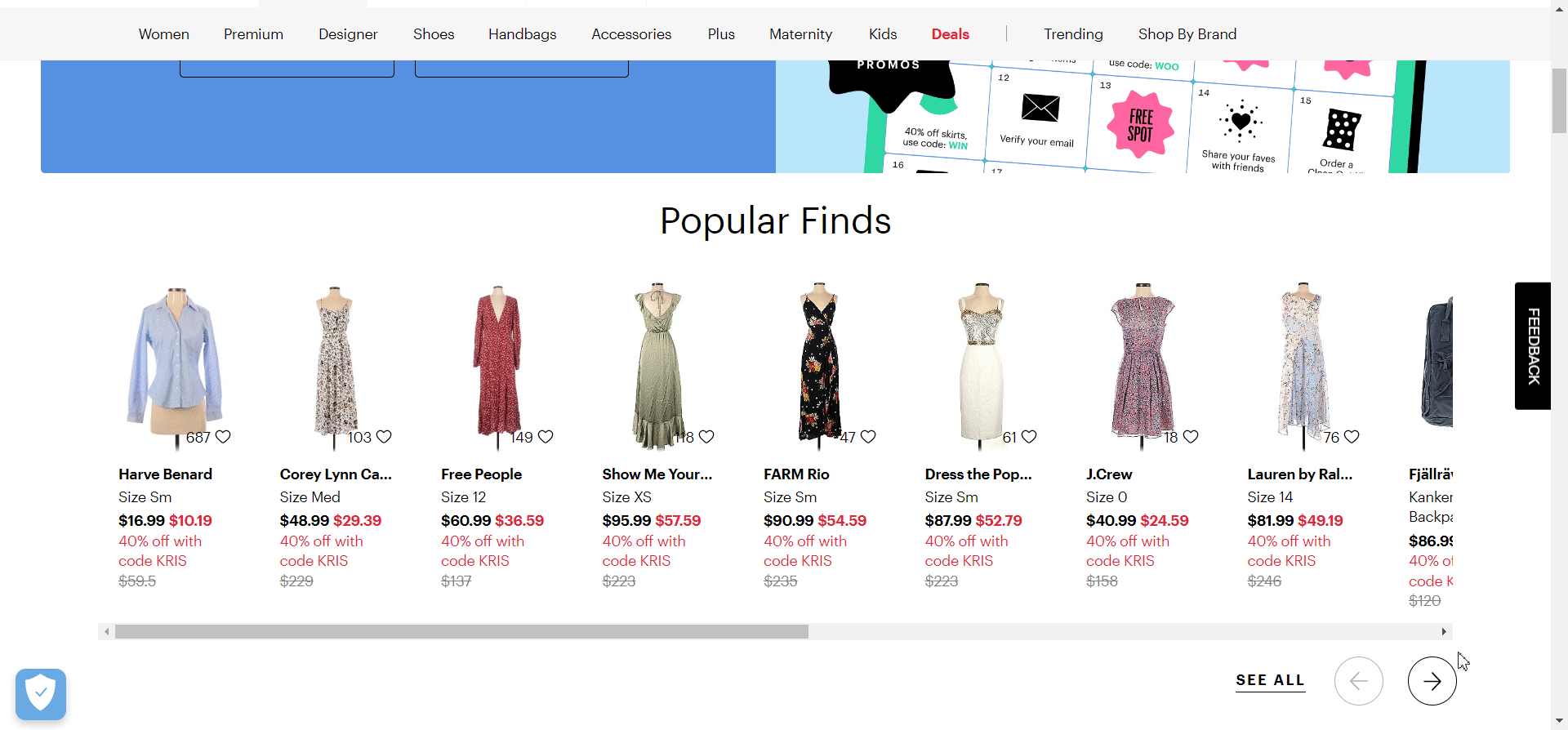
thredUP does an excellent job of implementing a product slider. Its carousel is placed slightly below the fold to avoid interfering with the store’s main promotional campaign, and the navigation arrows are highly visible while the See All button next to them nudges visitors to browse more products on a full, separate page.
Furthermore, notice how the slide bar serves two purposes. It not only acts as a progress bar to indicate how far users are in the carousel, but it also provides an alternative navigation option to the arrows so that users can move through the carousel quicker.
Where to Use Website Carousels
Website carousels are tricky to get right. If you don’t pay attention to the finer details, you’ll risk wrecking your website’s user experience.
First off, unless you’re thinking about implementing full-screen carousels, you should probably stay away from auto-forwarding slides. As mentioned before, they take control away from users, and it’s difficult to find the right slide movement speed for all visitors.
Additionally, automatic carousels often look similar to advertisements. This can lead visitors to ignore your carousels or view them as more of an annoyance than anything else. The Ralph Lauren example gets away with it due to its full-screen carousel and the inclusion of videos, which distinguish it from regular advertisements.
Secondly, your carousel’s navigation buttons should be clearly visible. You want visitors to know right away that the image they’re viewing is part of a slideshow. Make sure the navigation arrows are prominent and include dots or slide bars to indicate carousel progression.
Thirdly, remember that carousels are not a one-size-fits-all solution, and you should only use carousels if they bring additional value to your web pages.
It’s best to avoid them on content-focused websites like blogs, for instance. Otherwise, users won’t be able to concentrate on your content.
Here are a few use cases where carousels could work well:
- Product recommendations
- Product showcases
- Pricing pages
- Testimonials
- Hero sliders
- Portfolios
Of these options, testimonials and product showcases particularly stand out.
Testimonial carousels
Social proof is essential for winning a visitor’s trust and driving more conversions. It’s a good practice to include multiple customer testimonials that address common visitor uncertainties and affirm the quality of your products or services.
The problem is, cramming several testimonials into your web page can occupy a ton of your screen space, and it can also come across as pushy to your visitors.
Grouping testimonials under a carousel can mitigate this issue—it’s far less obtrusive and you’ll still manage to include plenty of social proof to strengthen your brand’s credibility.

Instapage handles this carousel type quite well. It opts for a clean look that only contains a single testimonial per slide.
Coupled with the lack of any other design elements in this web page section, the visitor’s attention is fully drawn to the slide’s copy. This increases the likelihood of visitors reading a testimonial in its entirety.
The navigation arrows also stand out through contrasting colors, clearly indicating that the slides are part of a carousel.
As for the testimonials themselves, Instapage follows a few of our recommended best practices. The copy is specific and describes how the platform helped its clients achieve their goals. This gives readers a deeper insight into how the platform works and allows them to set realistic expectations.
Also, notice how Instapage includes additional trust elements to further enhance credibility—the logo of the company the client works for, his name, and his position within the company.
Most notably, Instapage also includes the client’s headshot. This attracts attention and allows visitors to establish a human connection with the web page, giving each testimonial that extra oomph in trustworthiness.
Product showcases
This carousel type works great for product pages. It attracts attention to your products, gives your web pages a pleasant look, and saves screen space simultaneously.
Product showcase carousels are rather commonplace among ecommerce sites, so users can already expect to find them there. As such, the likelihood of not recognizing them or confusing them with advertisements is far lower.
Most website builders like Shopify and Wix allow you to implement this carousel type to your pages fairly easily, given how well they perform in this particular domain.
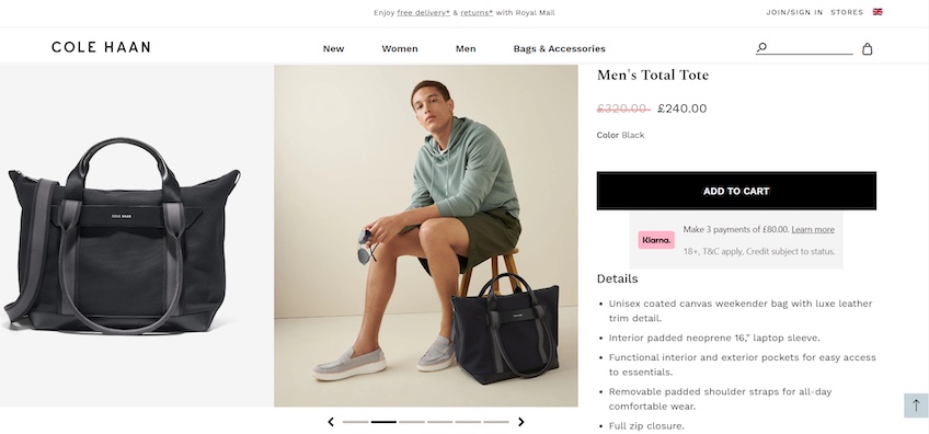
Cole Haan is an excellent example. It uses carousels to make room for larger images and shine a spotlight on its products.
Each slide contains two photos—perfect for showcasing products from multiple angles without going overboard. Visitors can also zoom in on the images to get a better look at the products.
The progress bar and navigation arrows are visible but do not drive attention away from the product photos.
The CTA button is large and stands out through its contrasting color. The product details are descriptive, listed above to fold, and organized under a neatly bulleted format to improve readability.
What’s the Catch with Website Carousels?
Website carousels have their uses, but as mentioned, they’re far from a one-size-fits-all solution. They come with many drawbacks that make them not worth it for a number of reasons.
They hinder content discoverability
Carousels don’t do a good job of nudging visitors to explore your content. Only a small percentage of visitors will go past the first slide (according to that study in the intro), which makes the rest of the content within the carousel almost invisible.
Carousels can be a barrier to entry, making it harder and more time-consuming for visitors to get to the content they want to see. Visitors are more likely to discover content by scrolling down a page than moving back and forth between slides.
This is also where banner blindness comes in. It refers to a visitor’s tendency to subconsciously ignore any design elements that resemble advertisements, with carousels being one of them.
Most carousels and banner ads have a rather similar look—they have a rectangular shape, emphasize imagery, include minimal copy, and are usually placed at the top of the screen.
In other words, visitors may not realize that your slides are part of a carousel in the first place.
They instill decision paralysis
Even if you manage to get visitors to browse through your slides, you’ll still need to take analysis paralysis into account. When carousels offer visitors too many options, they may feel overwhelmed and end up not interacting with any of the slides.
Think of website carousels as confusing junctions. Rather than leading visitors down a straight path from point A to point B, they show multiple pathways that start from the same point but lead to different destinations. Visitors won’t know which path to take, so they’ll likely abandon the carousel and its content altogether.
They lower conversion rates
Websites have one goal—generating more conversions. This could mean driving more sales, more newsletter signups, or more contact form submissions. In either case, you want to keep visitors focused and lead them down a straight conversion path.
Website carousels do anything but that, especially if you include them on your homepage. For instance, if you use a carousel to display your most popular products or discounts, visitors may miss out on them completely.
This ties in with the content discoverability, banner blindness, and decision paralysis issues mentioned earlier, and it only gets worse with auto-rotating carousels.
Again, if slides move too fast, users may miss out on the offers displayed within the slides. If they’re too slow, they’ll annoy visitors, likely causing them to leave your website.
Since they always move, auto-rotating carousels can also drive away attention from the rest of your website by being a constant distraction. Visitors will have trouble focusing on other static design elements on your web page that are more important, like CTA buttons.
They worsen the user experience
Sliding effects, multiple large images that load simultaneously, and a shaker of javascript code—the perfect recipe for slowing down your website and providing a bad user experience.
On top of that, since mobile devices generate 55% of web traffic, optimizing your website for mobile is crucial.
At first, carousels may seem like a good idea for mobile optimization—they hide several pieces of content behind slides, which declutters the screen and leads to an improved user experience, right?
In reality, carousels will often do the opposite. Slides can become hard to read once shrunken down for mobile viewports. And given their smaller size on mobiles, users will also find it difficult to swipe left and right between slides.
They’re bad for search engine optimization
A bad user experience comes with an aftereffect of increased bounce rates and a drop in search rankings. Aside from that, website carousels present additional crawlability issues.
Search engine bots have a crawl budget—the number of pages Google crawls and indexes within a given timeframe. Since carousels can severely impact page loading speed, the crawl budget will deplete prematurely, leaving some of your web pages unindexed.
Are Website Carousels Worth It?
For most cases, the answer is a solid no. Website carousels often do more harm than good. Not to mention that they require a lot of extra work to implement correctly, so ditching them in favor of a more traditional-looking web page will spare you from many headaches with little to no compromise.
Carousels may work well in specific use cases like product showcases or testimonials, but even then, you can’t count on getting visitors to browse through the slides.
Your website’s user experience should take the top spot on your priority list. Carousels can negatively interfere with that, so it’s best not to take the risk and display content using other methods instead.