Nowadays, you can get a website up and running in a few minutes. But there’s a difference between a website being live and it being optimized.
Why does design matter? It only takes 0.05 seconds for people to form an opinion about your website. Yes, you read that correctly—50 milliseconds for someone to be blown away or repulsed by your website. Most of that opinion is formed from the design.
Website design also impacts your conversions, credibility, and, ultimately, makes or breaks the success of your site. No website is perfect, but you should optimize it as much as possible.
Here’s something to take into consideration as well: After a bad experience, 88% of consumers are unlikely to return to a website. On top of that, a recent study found that 77% of agencies say that a poor website design is the most significant weakness of their clients.
Bottom line: If your web design isn’t optimized for user experience (UX), it’s going to be detrimental to your success. That’s why we wrote this guide.
Many factors go into designing a website. These are the thirteen most important elements to prioritize for your site. If you follow these best practices, the performance of your site will drastically improve.
Use this checklist to ensure you have a winning design
- Minimize text
- Show, don’t tell
- Use short sentences
- Try shorter paragraphs
- Choose a color scheme that fits
- Make your CTA clear
- Reinforce actions with familiarity
- Simplify the navigation
- Optimize your design for mobile
- Prioritize SEO
- Monitor your page loading speed
- Continuously run A/B tests
1. Minimize text
Don’t fill your pages with massive blocks of text.
We’re not talking about blog posts, which sometimes need to go in-depth (like this one!). We’re talking about your web pages (e.g. homepage, landing page). Keep the text to a minimum here.
You want to tell your website visitors all about you, your company, your brand, and your products. But you need to learn how to tell that story in just a few sentences or—even better— a few words.
2. Show, don’t tell
Visuals not only help you break up the written content, but they can also provide deeper explanation. Show your visitors what you’re about. They’ll understand more in a shorter amount of time.
Harry’s product page embodies both of these first two design principles:
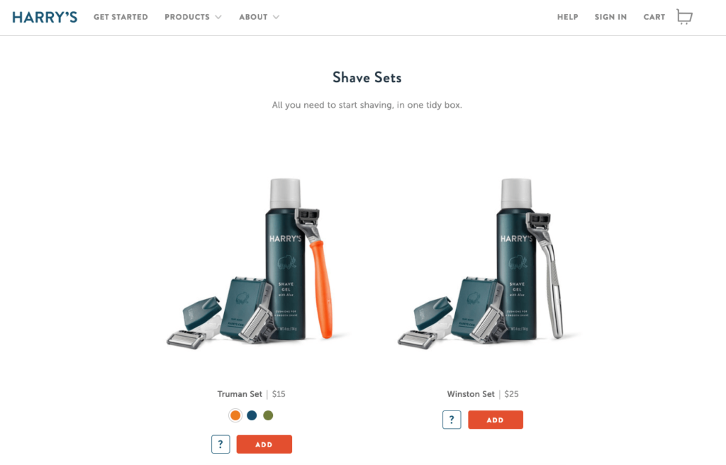
For example, let’s say your website sells razors, blades, shaving cream, and other shaving products for men.
You operate on a subscription business model and deliver these products to your customers on a monthly basis. The design of your razors is very handsome — they’re made of carved hardwood and are nice enough to give as a gift.
Rather than going into all of this detail on your homepage, you can simply have a photo of these products with text saying something like, “delivered to your door.” You get your message across in just four words.
Sure, you can go into greater detail the deeper the visitor gets into your pages, but a lengthy text description isn’t required.
3. Use short sentences
Short sentences are easier to read.
Don’t bombard visitors with big chunks of text. They won’t know where to start reading and won’t be able to digest your content.
Mix it up. If you need a long sentence, follow it with a short one. Variety helps.
4. Try shorter paragraphs
Use paragraph breaks to your advantage. It’s okay to write longer paragraphs, but we recommend keeping homepage paragraphs to a few sentences.
It’s also important not to overdo it. Too much of a good thing, is actually a bad thing.
Start each paragraph with new information, so if someone is scrolling they can quickly tell if they need to read that paragraph.
Eliminating unnecessary text on your pages reduces clutter AND puts more emphasis on your call-to-action.
Having the CTA stand out alone in its own paragraph is more impactful than burying it in a bunch of text.
A very useful tool in this situation are bullets. Instead of adding paragraphs and long-form writing, consider using lists. In those lists, use bullet points.

Studies show that more people will look at lists with bullet points than other formats. That’s because they help improve a page’s scannability and allow you to highlight the most important points you want to make.
5. Choose a color scheme that fits your branding strategy
The color choices you make on your website are more important than you think.
Visitors judge your website in less than 90 seconds. Most of that is a result of the colors you choose.
The best way to choose your website color scheme is with branding. Refer to your logo. Do the colors on your website fit with your brand image?
Here’s an example. Think of Starbucks.
When you hear this brand name, I’m sure you have an image in your head. Maybe it’s the logo, a sign, or a store location.
Do you associate any colors with that name? Now let’s look at their website.
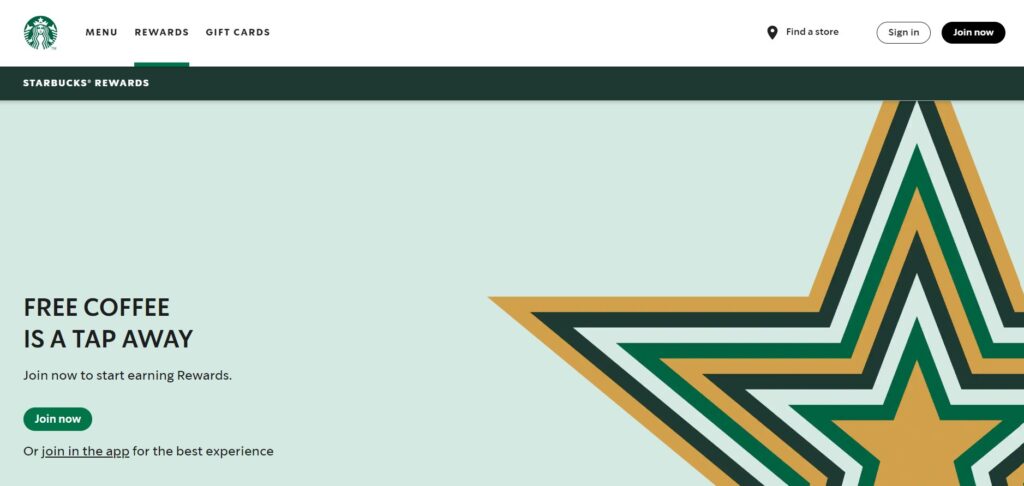
It’s no surprise that they went with a green color scheme.
This design choice matches their logo and brand image, which reinforces what consumers already associate with the brand. By keeping things consistent, there is no confusion. It would be odd if you visited this website and the colors were yellow and red. That has nothing to do with their brand.
We’ll talk more about reinforcement in greater depth as we continue.
6. Make your CTA clear and obvious
CTAs should not be buried. They need to be big, bold and powerful and they must clearly stand out as the action your visitors should take next.
Yet, most websites don’t have a CTA button that can be spotted in less than three seconds. There’s a good chance that you fall into the group that takes longer. That’s not the category you want to be in.
You can’t drive conversions without an effective CTA button.
You will almost never see a CTA on a business’ interior pages (the pages that explain what your brand does and what you offer). This is a major design flaw. You can’t expect visitors to navigate back to your homepage to convert.
Take a look at this CTA from Litmus.
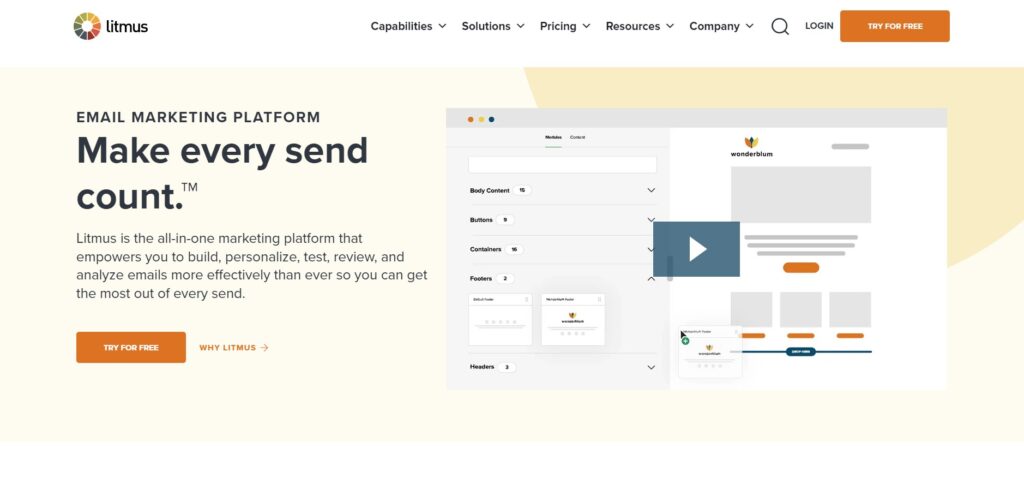
Look how simple this design is. There is minimal text on the screen, so the message is clear.
As a result, the CTA “try free” stands out. In fact, Litmus even put it in more than one location on the screen.
Where you should put your CTA differs from page to page. For example, blog posts should have the CTA up top so readers see it quickly and also at the bottom after they have read the post.
Go deeper: Want to optimize your CTAs? Here are 11 ways to improve your calls to action.
7. Reinforce actions with familiarity
If your message is the same, your CTA should be the same on every single page.
Think about how people navigate your website. Even if you set up a certain flow, not everyone will land on a page and convert in seconds. They may browse around for a bit first.
For example, let’s say you have an ecommerce website. You shouldn’t change the CTA button from page to page, which would look like this:
- Homepage: Checkout now
- Category page: Buy it today
- Product page: Click to purchase
If a visitor sees one of those buttons on your homepage, the other on a category page, and the third on a product page, there’s no reinforcement.
Instead, keep the messaging and the style consistent. Here’s a good example from the jewelry and accessories brand MVMT.

It doesn’t matter if you’re on their eyewear, watches, or jewelry page. You’re going to see the same “SHOP NOW” CTA for their products.
Each page also stays consistent with their website’s overall minimalist, black-and-white design.
Apply this design principle to your website as well.
It goes beyond the CTA button. The idea is to have this type of reinforcement with as many elements as possible.
Consistency in language, messaging, and design reinforces your brand identity and leaves a lasting impression on your visitors’ minds.
8. Simplify the navigation
It shouldn’t be difficult for a website visitor to find what they’re looking for on your site.
Put yourself in their shoes. Why are you visiting the website? How do you accomplish that task? Maybe you want to buy something, get more information, or see what there is to offer. Whatever that reason may be, if visitors can’t figure it out quickly, they’re going to leave.
There is just too much competition out there. Users have no reason to put up with unwieldy website navigation. All they need to do is leave your site and find what they need somewhere else.
Don’t try to reinvent the wheel with a complex design. Stick with the standard format.
For example, most websites put the navigation menu horizontally at the top of each page. If your menu is somewhere else, it might confuse your visitors.
The fewer options in the menu, the better. Otherwise, it will be too hard for people to find what they need. This concept is known as Hick’s Law.
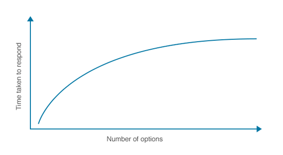
The more options you give someone, the longer it will take them to make a decision. That’s why complex designs and navigations will crush your conversion rates.
There’s a famous experiment about this, referred to as the jam study, which discusses the paradox of choice.
The experiment was conducted at a local grocery store. Consumers were presented with 24 jams to sample on one day, and six jams on the following day:
- The larger display on day one attracted 60% of shoppers, but only 3% of those people made a purchase.
- The smaller display of six jams on the second day attracted 40% of shoppers, but 30% of them made a purchase.
By limiting choices, conversions were ten times higher. This same concept can be applied to your website navigation.
Eliminate unnecessary menu options. For example, instead of having a “home” button, just use the website logo to link back to the home screen.
Take a look at Square’s homepage.
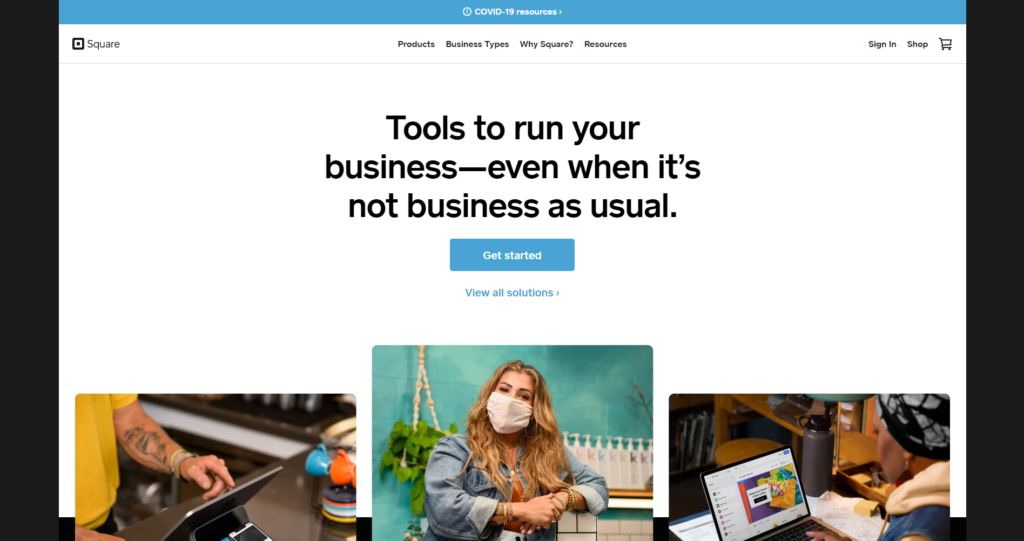
The design is super clean. The menu options are extremely limited. This makes it easy for visitors to choose a selection that fits their needs.
You’ll notice that there’s minimal text on the screen, and the CTA is clear and obvious.
This type of design makes it nearly impossible for website visitors to get lost or confused when they’re navigating.
For those of you who have lots of options on your website, such as an ecommerce shop, you can add a search bar to simplify the navigation process without using a complicated menu. A lot of software companies put their features in a features tab rather than have an individual tab for each feature.
9. Optimize your design for mobile devices
Mobile is how the majority of the world accesses the Internet. That means if you’re not optimized for mobile, your website is not going to perform well.
Search engines recognize this and reward sites that are mobile-friendly. Here are a few more stats to hit the point home:
- Google knows that 87% of smartphone owners use their devices to run an Internet search at least once per day.
- 58% of all Google searches are done from a mobile device
- The result: 70% of the first page results on Google are optimized for mobile devices.
Mobile SEO is the most important thing you can do in order to rank well on Google. Seriously.
If your website doesn’t look good on a smartphone, people won’t want to stick around. So, make sure your website designs are mobile-friendly.
10. Prioritize SEO
Everything you do on your site needs to circle back to SEO.
And it’s not enough to just add keywords here and there. It’s a website-wide system of improving content and relentlessly targeting specific subject matters to build your site authority in that area.
For example, a landing page for an ecommerce site will want to focus on certain on-page elements such as:
- Usability. How easy it is for your visitors to use and navigate.
- Mobile. How your website looks and performs on a mobile device.
- Keyword optimization. The words and phrases that you want to rank for.
- Internal links. How often you link to other pages on your website.
- Headline. This is often the biggest text on a web page. As such, it does most of the heavy lifting on your landing page.
So, create an XML sitemap. This will make it easier for search engine crawlers to analyze content on your website. A sitemap will show the bots the location of pages on your site, when the page was last updated, the updating frequency, and the relationship to other pages on your site.
A proper sitemap shows Google that you don’t have duplicate content, which can damage your SEO rankings.
When you’re designing your site, there are a TON of less obvious elements that factor into ranking on Google, too.
We’ve already gone over a few aspects you can improve on the page itself. But other elements include:
- Domain. Your URL is pretty consequential to your google rank. Key factors include having your keyword in the domain, how old the domain is, and what your domain extension is (e.g. high-quality such as .com, .net, .gov, .org versus nontraditional extensions).
- Site quality. Your website must be helpful to visitors. Key factors include an ‘About Us’ page, a ‘Contact Us’ page, how frequently you update your website, how easy it is to navigate your website, uptime (how often your website crashes), and SSL certificates.
- Backlinks. This refers to the frequency your website is linked to by other websites. It is a crucial factor for ranking well on Google. Key factors include the number of linking pages, the quality and authority of the websites linking to you, the anchor text they’re using to link to you, and whether or not those links come from .edu or .gov domains.
11. Monitor your page loading speed
We know what some of you are thinking. What does page loading speed have to do with web design? Everything.
Sure, loading times are related to your website hosting plan, server, traffic, and things of that nature. However, design choices can impact your loading times as well.
Each time you add an element to your site, especially images, videos, and other complex media files, your loading times can be affected. As such, it can slow down HTTP requests.
Slow loading times lead to high abandonment rates. You can’t ignore this. If your pages take too long to load, it’s going to be a huge problem.
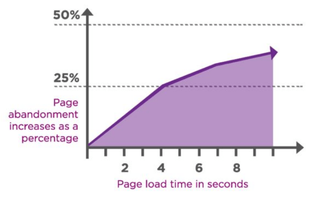
Furthermore, 25% of people abandon websites that take more than four seconds to load. Yes, four seconds. That’s all you have, or you’ll lose 25 out of every 100 visitors. Most visitors expect for a page to load in two seconds or less.
So how can you apply this to your web design?
- Reduce the file sizes of your images
- Take advantage of browser caching tools
- Reduce HTTP requests
- Improve your TTFB (time to first byte)
- Minify and combine your files
There are lots of tools available online to help you accomplish these things. For example, check out the WordPress Rocket plugin as a resource for minifying and combining your files. And use the Page Speed Insights tool from Google to help you monitor your loading times whenever you make design changes on your website.
12. Continuously run A/B tests
When it comes to your website design, you can’t just set it and forget it.
As we said earlier, no website is perfect. There are always ways for you to improve your design.
That’s why you need to run A/B tests. These allow you to make regular improvements to your website and test out elements to see what works the best and, more importantly, what isn’t working at all.
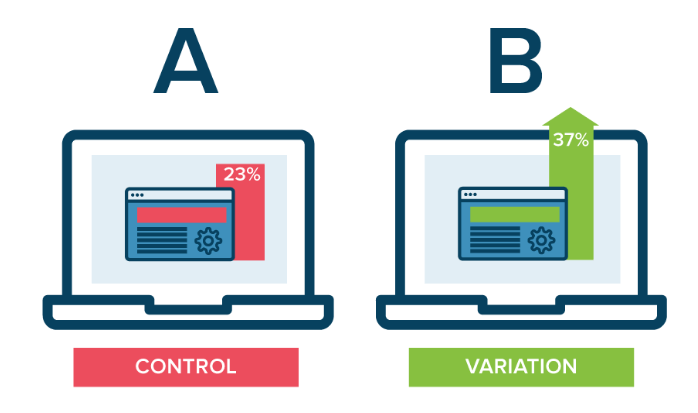
Nearly every element of your site design can be tested. For example, you could create two different landing pages that have different CTAs but are otherwise the same. If one landing page performs better than the other, you’ll know that its CTA is likely getting the job done.
Here are some quick suggestions to get you started in the right direction:
- Test the location of your CTA button.
- Test the color of your CTA button.
- Test the CTA copy.
- Test the images that you’re using on landing pages.
- Test wording variations of text on the screen.
- Test the size of your navigation bar.
There are so many options, we could spend all day talking about this. For those of you who aren’t familiar with A/B tests or need some help, check out our guide on everything you need to know before you start A/B testing.
Conclusion
Saying that the design of a website is important would be an understatement. Your web design choices will ultimately impact whether or not your site is successful.
- Everyone’s website can be improved. Use this list as a guide as a resource to help you make those improvements.
- Don’t get overwhelmed. We’re not saying you need to implement all of these design suggestions overnight, but you need to start somewhere.
- We didn’t pull these ideas out of thin air. Everything on this list is backed by research and statistics related to design principles.
Remember: Every website is a work in progress. If you put the work in and always fine-tune your website, you’re going to improve your edge with your competitors.
It doesn’t matter if your website is brand new or if it’s been around for a decade. These are the web design best practices that you need to follow.
